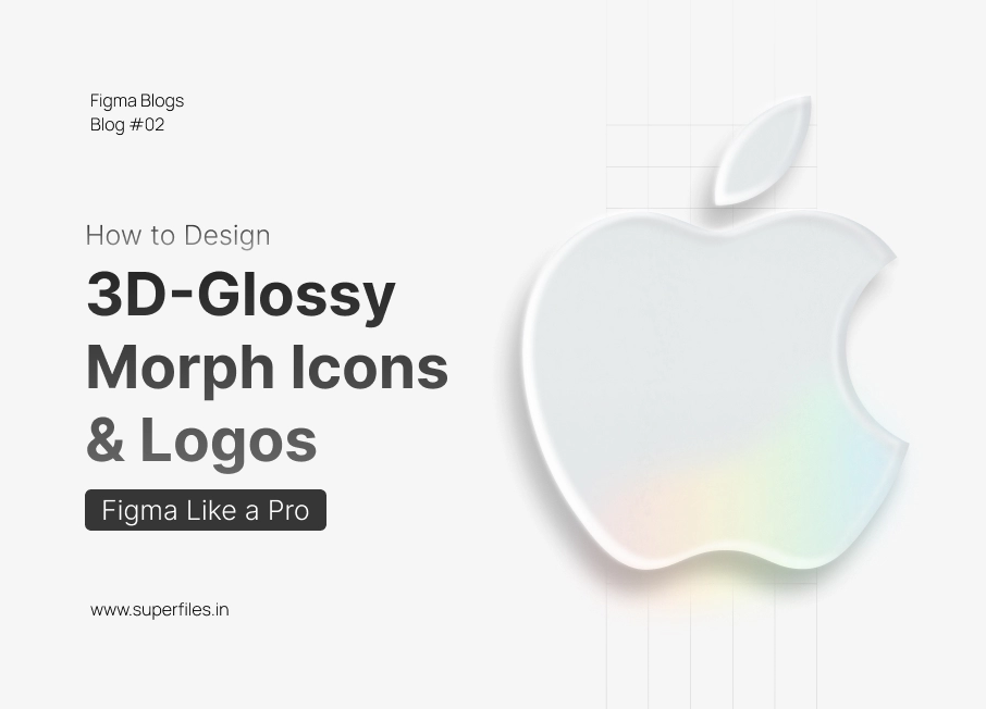
Before You Start
Before diving into effects, set your background color to #f6f6f6. This slightly off-white tone helps you see lighting and shadow transitions clearly. It also enhances the realistic depth once you start layering highlights and inner shadows. Looking for more Figma techniques? Check out our Figma keyboard shortcuts guide to speed up your workflow.
Step 1: Add Base Fill Color

Copy your logo or icon shape to the artboard. Apply a Fill color of #E7EBEC. This acts as your neutral base material — think of it like a soft matte surface that will later catch light and shadow. Avoid using pure white; the slight gray tint gives room for shadows and highlights to stand out naturally.
Step 2: Add Drop Shadow for Depth
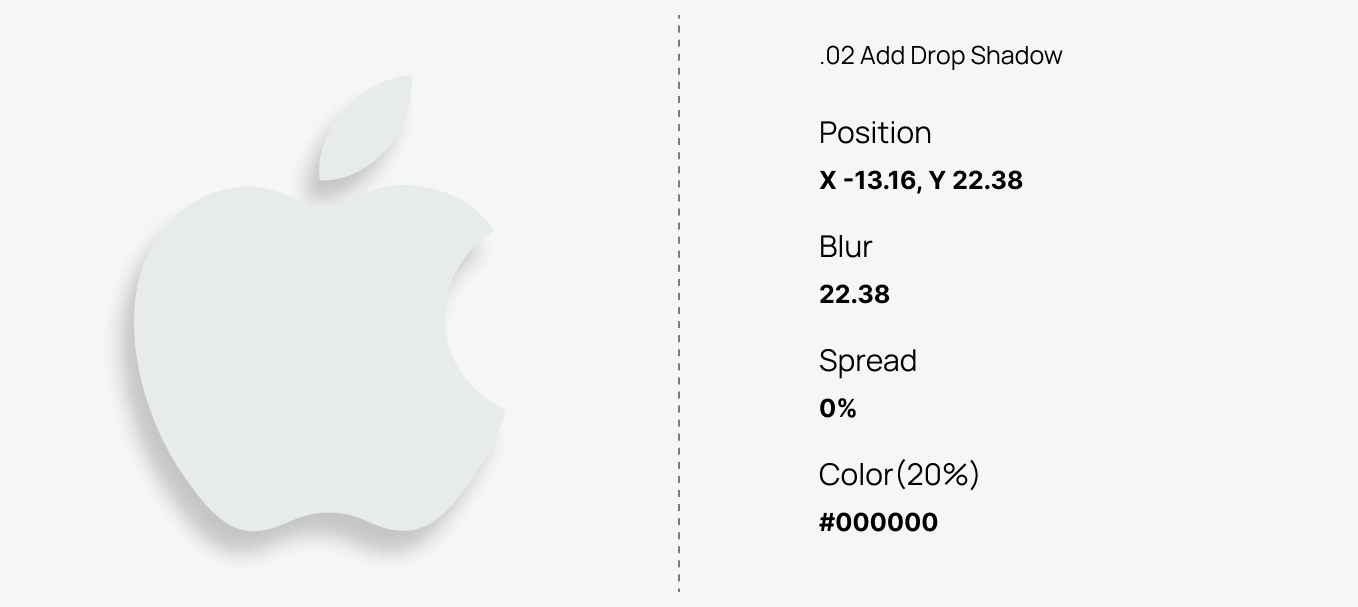
The drop shadow creates the illusion of separation between your icon and background. Keep it soft and subtle — this isn’t a harsh UI shadow but more like a smooth lift.
- Position: X -13.16, Y 22.38
- Blur: 22.38
- Spread: 20%
- Color:
#000000 (20%)
The result should be a soft, bottom-right shadow that gives your logo the look of floating gently above the surface.
Step 3: Add First Inner Shadow (Light Source Effect)
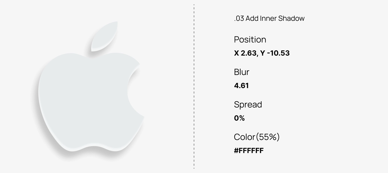
Inner shadows simulate the light hitting your object and create volume. The first inner shadow defines the top highlight area, mimicking a soft reflection.
- Position: X 2.63, Y -10.53
- Blur: 4.61
- Color:
#FFFFFF
Notice how this gives the top edge a slightly raised appearance — like light bouncing off a glossy button.
Step 4: Add Second Inner Shadow (Subtle Depth)
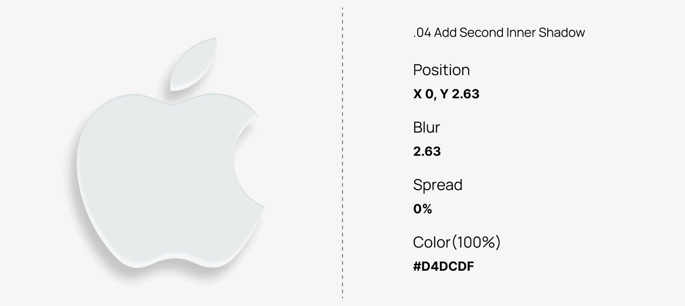
This layer enhances the realism by adding a faint shadow at the bottom. It helps balance the bright highlight from Step 3 and deepens the form.
- Position: X 0, Y 2.63
- Blur: 2.63
- Color:
#D4DCDF
Step 5: Add Third Inner Shadow (Soft Reflection)
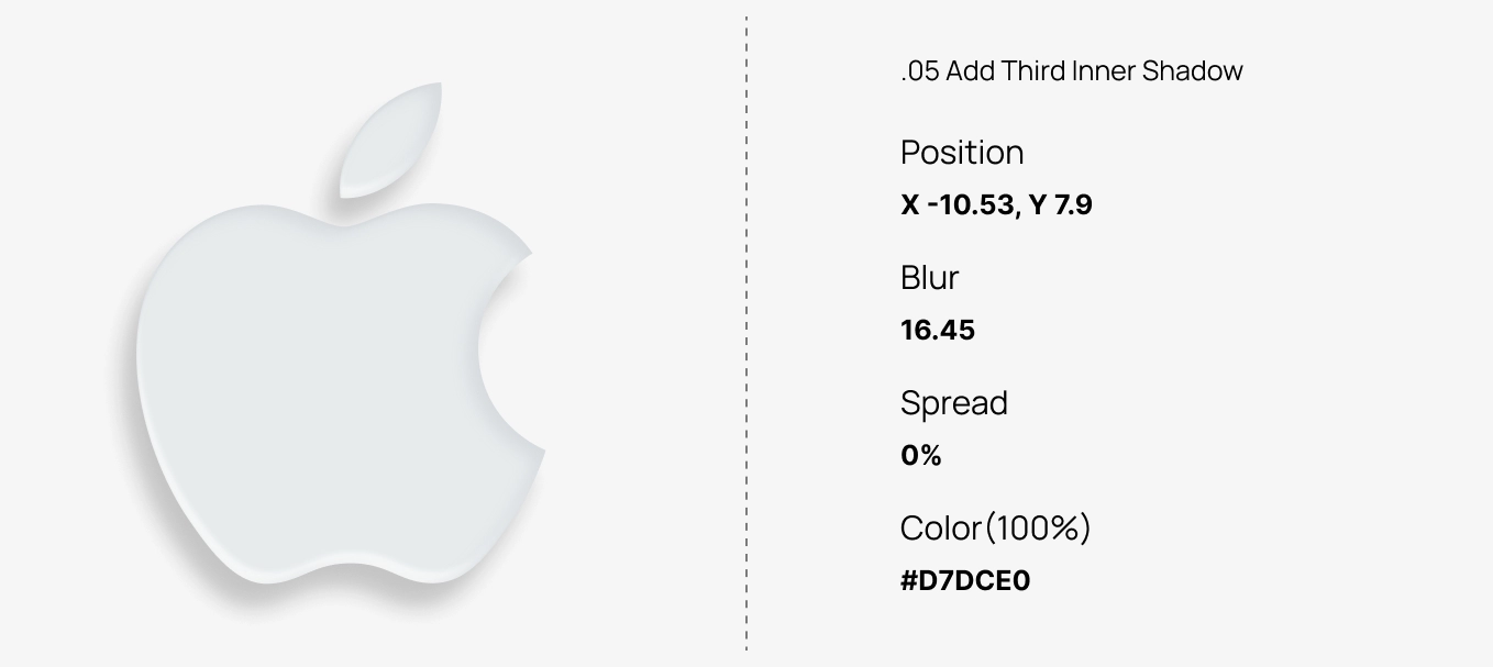
Adding a third inner shadow introduces mid-tone variation — the key to realistic glossy morph surfaces. This creates the “morph” illusion where one side looks slightly concave and the other convex.
- Position: X -10.53, Y 7.9
- Blur: 16.45
- Color:
#D7DCE0
Step 6: Add Highlight Layer for Gloss
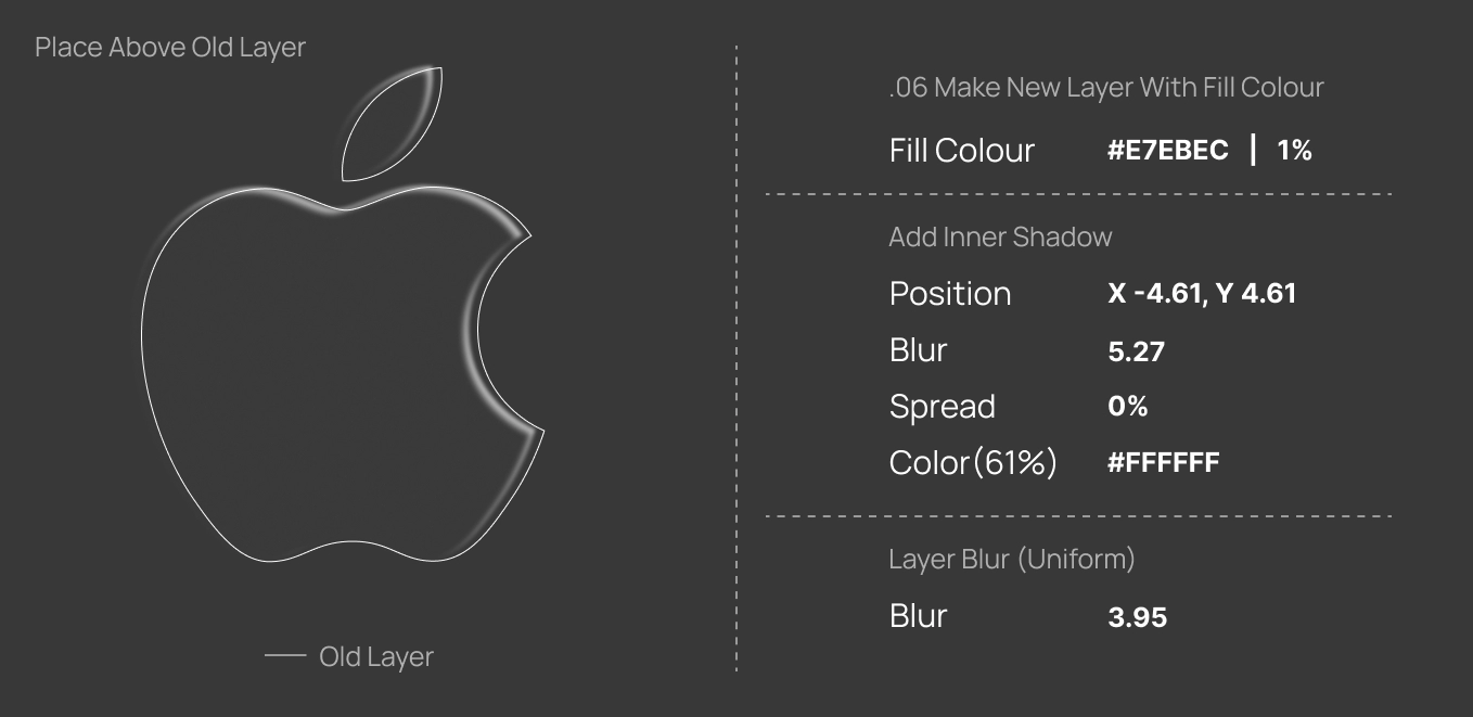
Create a new overlay layer using Fill #E7EBEC at 1% opacity. This acts as a soft light veil over the base — ideal for adding that subtle glossy sheen.
- Inner Shadow: X -4.61, Y 4.61
- Blur: 5.27, Color:
#FFFFFF (61%) - Layer Blur: 3.95
The icon should now begin to reflect light more realistically, with smooth surface transitions similar to glossy plastic or coated metal.
Step 7: Add Gradient Depth Layer
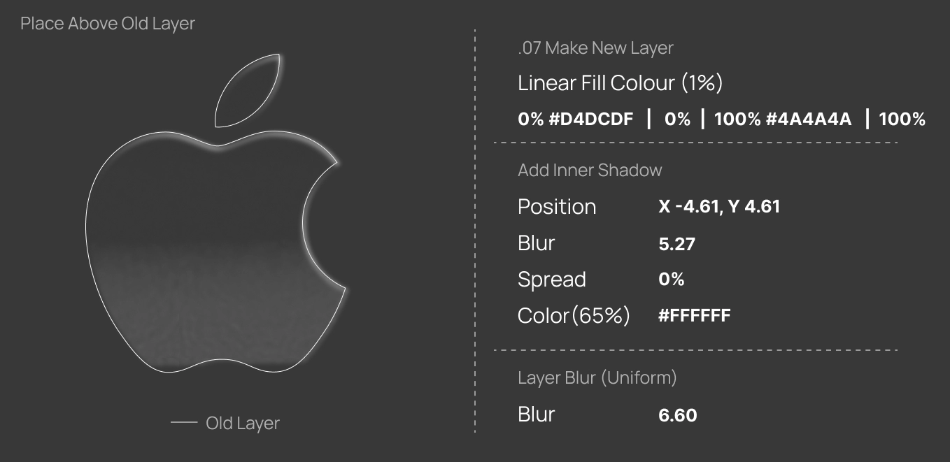
Gradients introduce dynamic lighting — making your icon look more sculpted. Use a very low-opacity gradient from light gray to deep gray to simulate light falloff.
- Gradient:
0% #D4DCDF → 100% #4A4A4A(1% opacity) - Inner Shadow: X -4.61, Y 4.61, Color:
#FFFFFF (65%) - Layer Blur: 6.60
You’ll see a gentle curvature — this step transitions your design from “flat” to “3D morph”.
Step 8: Add Final Light Reflection Layer
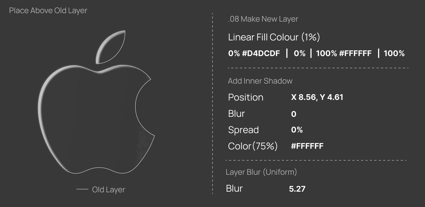
This layer gives your morph effect a polished, almost glass-like finish. It mimics a subtle reflection of ambient light across the surface.
- Linear Fill:
0% #D4DCDF → 100% #FFFFFF - Inner Shadow: X 8.56, Y 4.61, Color:
#FFFFFF (75%) - Layer Blur: 5.27
Step 9: Add Gradient Morph Overlay
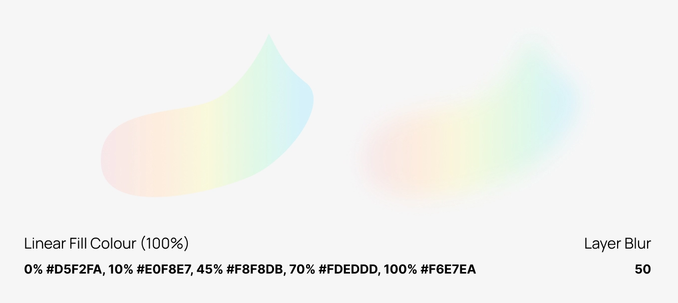
Finally, create a random organic shape on top and apply a bright, colorful gradient. This adds energy and visual interest — the “wow” factor in your 3D morph design.
- Gradient: 0%
#D5F2FA, 10%#E0F8E7, 45%#F8F8DB, 70%#FDEDDD, 100%#F6E7EA - Layer Blur: 50
The soft blur blends the colors together, creating a dreamy, futuristic morph surface that looks alive under the light.
Pro Tips
- Use consistent light direction across your icons for a cohesive UI look.
- Experiment with slight color shifts in the base fill to match your brand tone.
- Group all shadow layers and convert them into components for reusability.
- Add soft overlays of blue or pink tones for more realistic reflections.
- Need ready-made designs? Browse our free Figma login screen templates.
Final Thoughts
The glossy morph style is a balance of subtlety and precision. Each layer — shadow, highlight, and blur — contributes to a sense of soft realism that elevates your icons beyond flat design. Once you’ve mastered these steps, try adapting this technique for app icons, badges, or even 3D-style buttons.

Superfiles


Lemonade Wishes