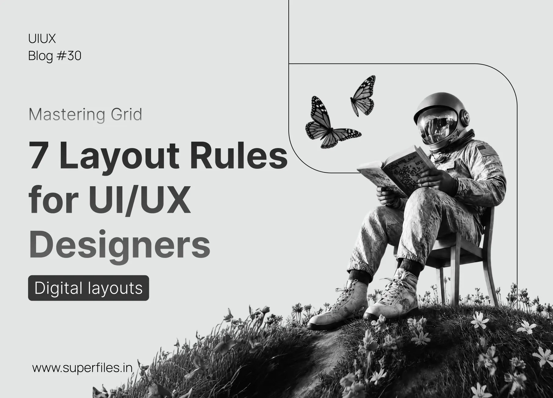
The Invisible Skeleton of Elite Design
Have you ever looked at a layout and immediately felt that it looked exceptionally clean, polished, and professional—even if you couldn't point out exactly why? That feeling is rarely an accident. It is the result of a meticulously planned grid system.
At its core, a grid is a layout structure that organizes design elements with clarity and balance. It acts as an invisible skeleton, holding text, shapes, and images together in a harmonious system. Without a grid, your design is just a collection of random alignment guesses. With it, you gain the power to manage cognitive load, guide the user's eye, and build visual rhythm.
To elevate your UI/UX and web design skills, you need to move past standard alignment tools and master the 7 core grid systems used by senior product designers worldwide. Let's break them down, interact with their controls, and see how they apply to real-world products.
Baseline Grid
The "Vertical Rhythm" BlueprintKeeps typography aligned for consistent vertical spacing and rhythm. The baseline grid behaves like lined notebook paper, ensuring that the bottom edge of every text line snaps onto a repeating vertical division.
Vertical Rhythm & Rhythm Alignment
Typography is the foundation of user interfaces. By snap-aligning text blocks onto a strict baseline rhythm, columns line up perfectly across the page, preventing cognitive fatigue and creating a reading experience that feels comfortable and cohesive.
When text runs unsnapped, layout heights vary arbitrarily, resulting in cluttered spaces that compromise reading flow.
When to use: In text-heavy interfaces, blogs, editorial web designs, and dashboards with side-by-side content blocks.
Design Tip: Your line heights and margins should always be mathematical multiples of your baseline rhythm unit (typically 4px or 8px).
Modular Grid
The "Bento & Matrix" SystemCombines columns and rows to partition a layout into a matrix of consistent compartments (modules). This system dictates both the horizontal and vertical alignment of content blocks, making it highly versatile.
Main Hero
Spans 2 columns, 2 rows
Status
Spans 2 columns, 1 row
Stats
Spans 1 col, 2 rows
Link
1 x 1
Footer info
Spans 2 cols, 1 row
Icon
1 x 1
When to use: In dashboard designs, Bento grids, card components, image grids, and data visualization interfaces.
Design Tip: Use modular grids when displaying diverse content types (images, numbers, lists) simultaneously in a single viewport.
Radial Grid
The "Circular Coordinate" SystemArranges elements around a central point, radiating outward along circular paths and specific angles. This system relies on polar coordinates rather than linear columns.
When to use: For smart dial interfaces, loading indicators, wheel menus, smart watch UIs, and dynamic data visualizers.
Design Tip: Ensure that rotation animations maintain center-point stability to prevent the layout from wobbling off-axis.
Manuscript Grid
The "Single Column & Book" SystemA single-column layout with fixed outer margins. It isolates a single block of text on a page, establishing clear boundaries between readable content and empty breathing space.
When to use: In PDF reader apps, e-commerce checkout forms, digital document readers, and blogs focusing on minimalist, immersive reading.
Design Tip: Make margins generous. An elite manuscript grid relies on whitespace to convey premium authority.
Column Grid
The "Standard Responsive UI" GridDivides content into vertical sections. Elements are placed along vertical tracks called columns, separated by empty spaces called gutters. This is the industry standard for responsive websites.
When to use: In multi-device responsive web layouts, marketing websites, and landing pages.
Design Tip: Align element edges precisely with the grid boundaries, not with the gutters themselves.
Axial Grid
The "Swiss Asymmetry" AnchorOrganizes elements relative to a single vertical or horizontal structural line (an axis). All elements anchor their edges to this line, creating asymmetrical layout balance.
Visual Art
Right-aligned edge anchors precisely to axis line.
Design Craft
Left-aligned edge anchors precisely to axis line.
METRIC
Center aligned directly over axis
When to use: In poster designs, timeline layouts, interactive resume pages, and Swiss design typography portfolios.
Design Tip: Break the grid intentionally. Having one single offset element overlap the axis can create a beautiful focal point.
Hierarchical Grid
The "Organic Visual Weight" GridAn organic layout structure based entirely on the importance of elements rather than repeating mathematical increments. Size and spacing convey priority directly to the eye.
WE DESIGN SCALABLE EXPERIENCES
Crafting meaningful UI layouts with structural clarity and absolute grid alignment logic.
When to use: In digital editorial sites, newspapers, portfolios, and product landing pages.
Design Tip: Maintain proper hierarchy by giving your most important element (like a header or image) twice as much size and contrast as the secondary items.
Conclusion: Build with Structure, Break with Intent
Grids are not prison bars designed to restrict your creativity; they are tools that offer architectural freedom. By masterfully applying modular, column, radial, or axial alignment tracks to your wireframes, you ensure that every block, font size, and gutter serves a functional purpose. Build with structure, establish absolute balance, and then, break the rules intentionally to create moments of unexpected delight.

Superfiles


Lemonade Wishes