The Pinterest Scroll Trap
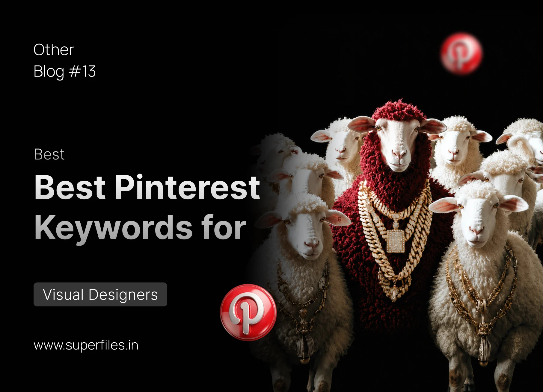
We've all been there, 45 minutes deep into Pinterest with nothing to show for it. The problem isn't the platform. It is the keywords. The right keyword unlocks a whole world of high-quality inspiration, exactly what you need, right when you need it. 🎯
When you type generic words like "graphic design" or "cool layout," Pinterest feeds you recycled, low-effort designs. But by speaking the exact language of art movements, specific styling materials, and aesthetic systems, you can train the algorithm to display elite-level visual work. Here are the 10 best Pinterest keywords every visual designer should have bookmarked.
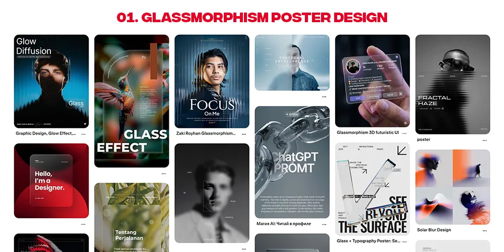
Glass Morphism Poster
The "Frosted Glass" Depth LookA modern design style using blurry, semi-transparent panels with bright glowing colors in the background, mimicking physical frosted glass. Perfect for adding visual depth and premium modernism to layouts.
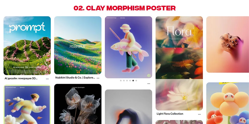
Clay Morphism Poster
The "Tactile 3D Play-Doh" AestheticSoft, tactile 3D elements combined with bold typography and pastel gradients to create a friendly, toy-like visual aesthetic. It feels bubbly, responsive, and organic.
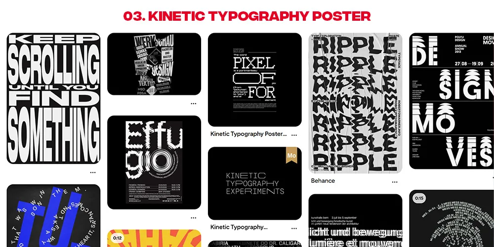
Kinetic Typography
The "Warped & Stretched Type" LookStretching, bending, warping, and repeating letterforms to convey motion and high energy even in static graphic layouts. It forces typography to become the main graphic element.
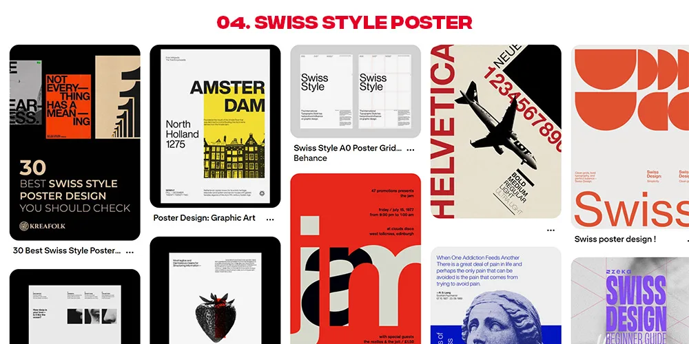
Swiss Design Poster
The International Typographic StyleThe timeless champion of visual organization, utilizing rigid grids, bold sans-serif typefaces (like Helvetica), asymmetrical layouts, and high typographic contrast.
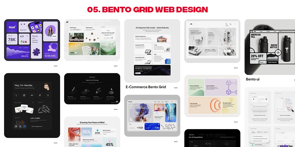
Bento Grid Layout
The "Apple-Style Modular" LayoutOrganizes multiple pieces of information or visual blocks into rounded rectangular compartments of varying sizes. It looks extremely clean, structured, and modern.
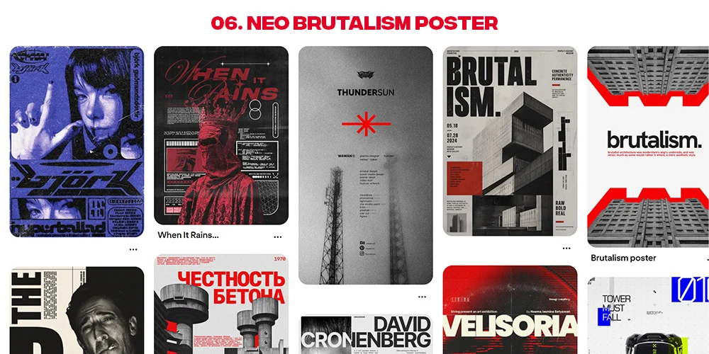
Neo-Brutalism Poster
The "Clashing & Raw Outline" AestheticHigh-contrast thick black outlines, stark dropshadows, bright clashing colors (often neon), and raw, unfiltered UI-inspired patterns that break classic design conventions.
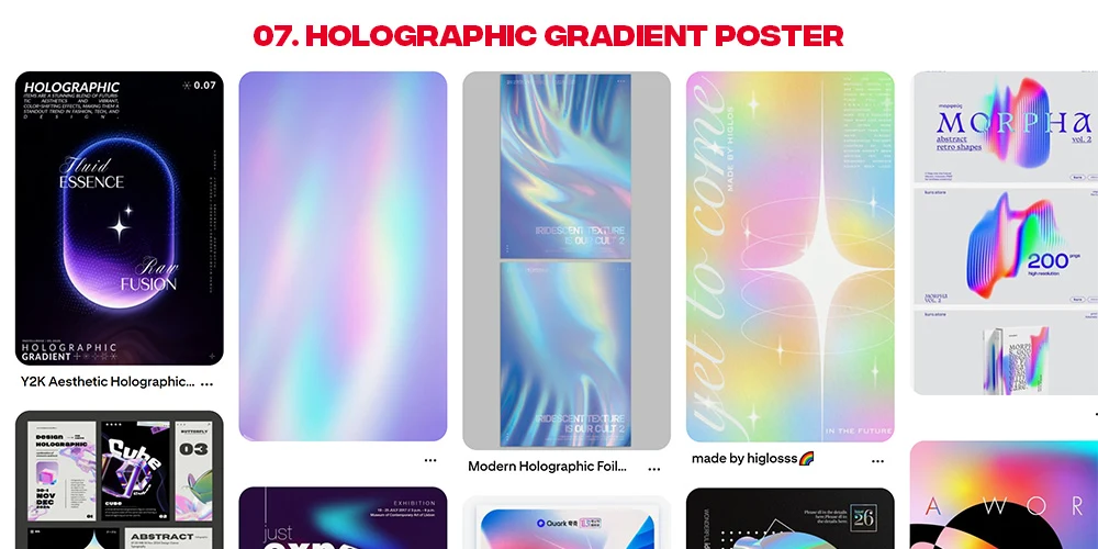
Holographic / Iridescent Gradients
The "Metallic Chrome Foil" LookShiny, metallic color palettes shifting dynamically between magenta, cyan, and gold. Perfect for futuristic, high-tech, and high-contrast creative branding.
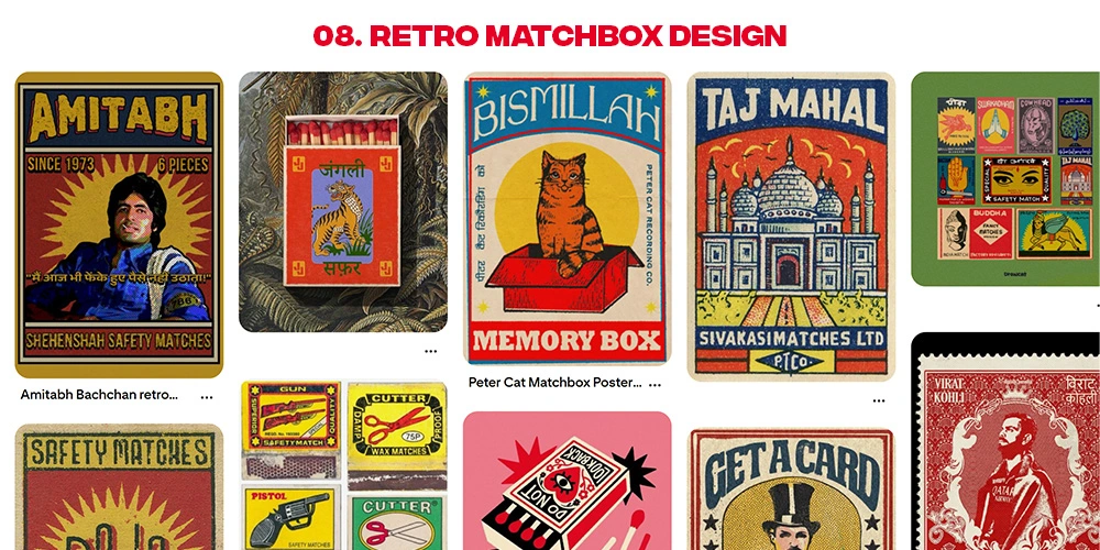
Retro Matchbook Art
Vintage Commercial IllustrationNostalgic mid-century commercial advertising illustrations featuring offset print textures, intentional misaligned layers, grainy ink, and simple bold shapes.
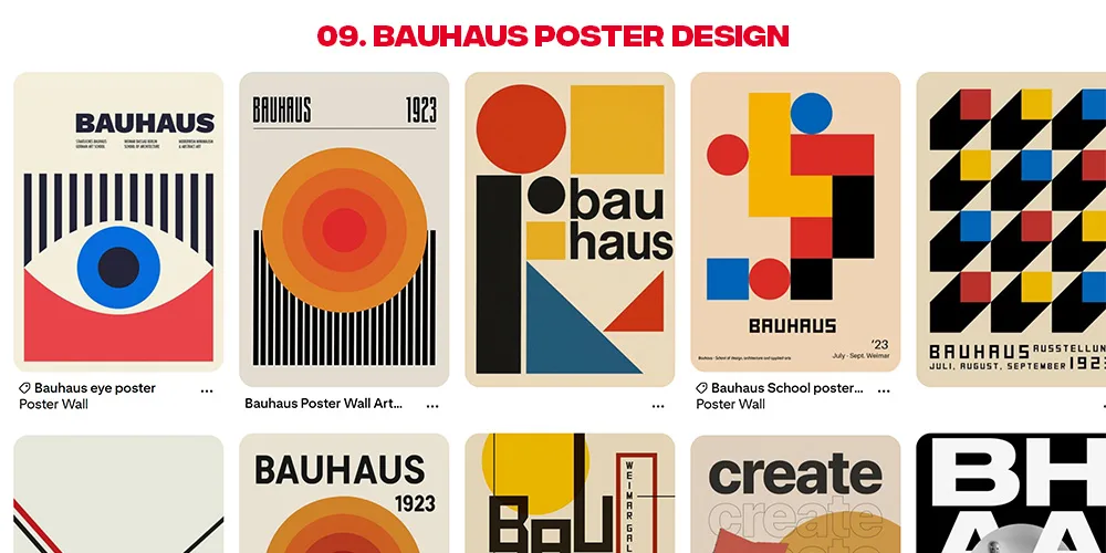
Bauhaus Poster Design
Geometric Minimalist Art MovementMinimalist layouts focusing on the interaction of primary shapes (circle, square, triangle) and primary colors (Red, Blue, Yellow). It looks highly structured, mechanical, and architectural.
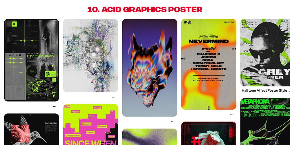
Acid Graphic Design
The "Y2K Chrome & Grunge" lookLate 90s and early 2000s cyber-culture design featuring liquid chrome 3D typography, tribal vector elements, grunge textures, and high contrast metallic lighting.
Conclusion
Bookmark these terms. The next time you are staring at a blank canvas or looking to build a specific mood board, copy and paste these precise keywords to unlock an infinite collection of elite, highly relevant designer resources.

Superfiles


Lemonade Wishes