The Rise of Low-Fi Digital Texture
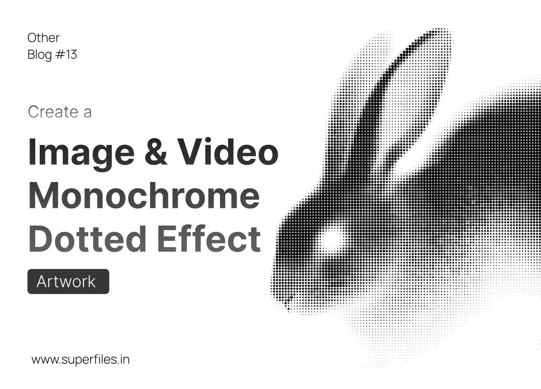
Retro is back in full force. In an era dominated by hyper-realistic 3D graphics, ultra-high-definition displays, and perfect gradients, designers are looking backward. From Spotify's gritty album art campaigns to retro indie gaming layouts, the texturized, high-contrast charm of the monochrome dotted effect is taking over visual communication.
Whether you call it stippling, dithering, or halftoning, this layout technique reduces complex, full-color visuals to a stark, raw pattern of pixels or circles. It feels tactile, intentional, and incredibly stylistic. But how does it work, and how can you leverage it to make your next web design pop?
In this guide, we will cover the technical details behind monochrome dotted effects, explore why they have become a staple of premium modern websites, and walk through where you can apply them. Best of all, we have built a completely free, browser-native tool called Superpixel to let you process both images and videos locally in one click.
What is the Monochrome Dotted Effect?
Halftones, Dithering & Binary ShadingAt its core, a monochrome dotted effect is the process of translating a full-range grayscale image into a binary map containing only two colors (usually black and white, or a neon duo-tone). Since there are no mid-tones available, the illusion of shading is created by distributing dots in varying sizes or densities.
There are two primary methods to achieve this effect:
- Halftoning: This printmaking method varies the size of the dots based on brightness. Dark shadow regions receive large, overlapping dots, while highlight regions receive tiny, isolated dots. This mimics classic newsprint and comic books.
- Dithering: Popularized by 8-bit computers, dithering uses mathematical grids (like Bayer matrices) or error diffusion (like Floyd-Steinberg) to scatter individual pixels. This creates structured geometric lattices or organic grain-like noise to blend regions together.
Try the Live Interactive Simulator:
Hover or drag on the canvas below to move the light source and watch how the halftone dots recalculate in real-time!
Design Tip: When using halftones for digital display, slightly overlapping the dots (increasing dot scale relative to the grid cell size) creates a bolder, more graphic pattern that is highly legible on mobile screens.
Why Use Monochrome Dotted Effects?
Aesthetic Power meets Print-Ready UtilityConverting your media to dithered patterns isn't just a design gimmick. It holds massive advantages for both design direction and physical file handling:
- 1. Punk & Cyberpunk Branding: The raw, bitmapped look strips away standard polish and injects instant personality. It feels digital yet organic, perfect for web developer portfolios, tech products, and streetwear brands.
- 2. Flawless Screen Printing & Laser Engraving: Because the final image file contains exactly two colors and zero gray opacity, it can be scaled infinitely or split onto silkscreen separation plates without any gradient clipping issues.
- 3. Bandwidth and Speed Optimization: Full-color images and background videos take megabytes of bandwidth. Dithered monochrome graphics can be exported as indexed PNGs or compressed SVG vector grids, shrinking page weight by up to 80% while retaining extreme styling.
Where to Apply the Effect in Web Layouts
Elevating Hero Sections, About Grids & LogosImplementing a dotted texture across different sections of your layout breaks up visual monotony and establishes a robust creative system:
1. The Hero Section (Background Video)
Full-color video backgrounds often create accessibility issues, clashing with header typography. Running your video clips through Superpixel's video engine converts them frame-by-frame into monochrome dithered loops. This drastically lowers CPU rendering overhead, compresses file size, and creates a high-contrast backdrop that allows overlaying text to remain perfectly readable.
2. The About Page (Cohesive Headshots)
Unifying team photos is a classic corporate challenge. Avatars are often taken with different phone cameras, lighting, and backgrounds, resulting in a cluttered grid. Processing all team photos with a uniform halftone dotted filter strips away conflicting colors and background details, unifying the entire grid into a single, cohesive art direction.
3. Client & Testimonial Grids
Brand logo sections are notoriously messy. Having bright red, blue, green, and orange client logos side-by-side ruins a clean layout. Rather than using simple grayscale filters, converting client logos into monochrome stippled shapes unifies their visual weight, turning an ugly list of logos into a beautiful, cohesive bento grid panel.
Implementation tip: Try applying the halftone filter with neon colors (like matrix green or glowing amber) and combining it with a dark mode background for a truly high-end cyber aesthetic.
Get Started Instantly with Superpixel
You don't need expensive photo editors or complicated video plugins. Our browser tool, **Superpixel**, lets you upload images and short video clips, tweak settings live, and export dot-matrix patterns in seconds. The tool is 100% client-side, meaning your files are processed locally on your machine and never uploaded to any server.

Superfiles


Lemonade Wishes