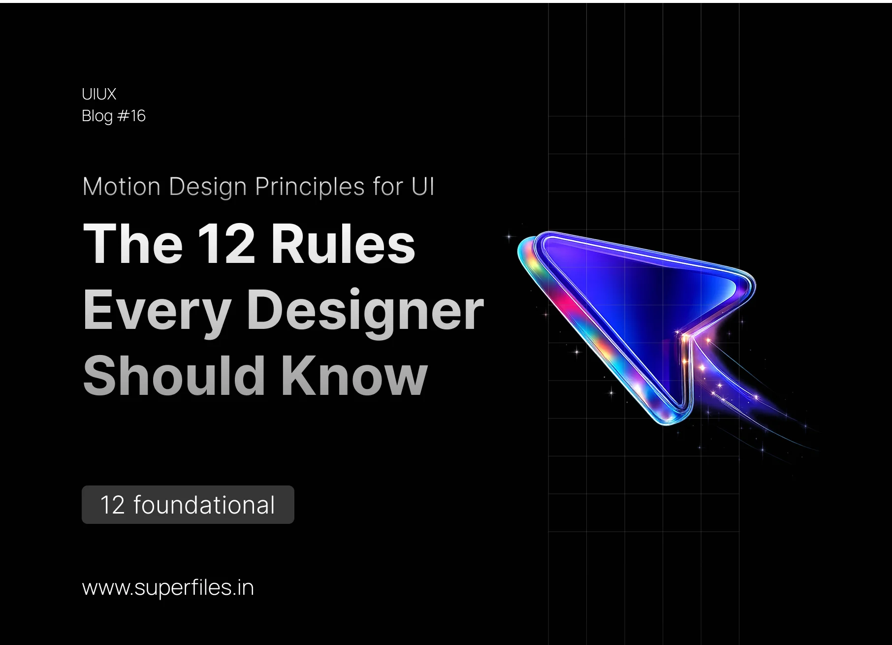
It's Not Decoration — It's Communication
Animation is the difference between a UI that feels like a static PowerPoint and one that feels alive — like Stripe, Linear, or Apple. But here's the problem: most designers either skip animation entirely, or they add random bouncing and fading that makes things worse.
Motion design is not decoration. Every animation should answer one question: "What just happened, and what should I look at next?"
This guide covers the 12 foundational rules of motion design for UI. Whether you use Figma, Framer, CSS, or After Effects — these principles are universal. Learn them once, and every interface you design will feel 10x more polished.
Purpose First
Every animation must have a job: feedback, orientation, focus, or continuity. No decorative motion.
Easing Is Everything
Never use linear. Ease-out for entries, ease-in for exits, ease-in-out for on-screen changes.
Duration Matters
100ms for micro-interactions, 200–300ms for transitions, never above 500ms for functional UI.
60fps or Delete It
Only animate transform and opacity. Everything else kills performance.
1. Every Animation Needs a Job
This is the #1 mistake. Designers add animation because it "looks cool." But purposeless animation is worse than no animation — it slows users down and adds cognitive load.
2. Easing Is Everything (Never Use Linear)
If you learn nothing else from this guide, learn this: never use linear easing for UI animation. Linear motion looks robotic and unnatural because nothing in the real world moves at a constant speed.
| Easing Type | CSS Value | When To Use |
|---|---|---|
| Ease-Out | cubic-bezier(0.0, 0.0, 0.2, 1) |
Elements entering the screen. Fast start, gentle landing. |
| Ease-In | cubic-bezier(0.4, 0.0, 1, 1) |
Elements leaving the screen. Slow start, fast exit. |
| Ease-In-Out | cubic-bezier(0.4, 0.0, 0.2, 1) |
Elements that stay on screen and change position or size. |
Ease-out is used ~80% of the time in UI because most animations are things appearing. The fast start grabs attention, and the gentle deceleration feels natural — like a ball rolling to a stop.
transition: all 0.3s linear;
transition: all 0.3s cubic-bezier(0, 0, 0.2, 1);
3. Duration Matters More Than You Think
Too fast = the user misses it. Too slow = the user waits for your UI. The sweet spot depends on what's moving and how far it's traveling.
| Animation Type | Recommended Duration |
|---|---|
| Micro-interactions (button hover, toggle) | 100–150ms |
| Simple transitions (fade, color change) | 150–200ms |
| Medium transitions (modal, card expand) | 200–300ms |
| Complex transitions (page morph) | 300–500ms |
| Large background animations (hero, parallax) | 500–800ms |
4. Choreography — Don't Move Everything at Once
When multiple elements animate simultaneously, the result is visual chaos. Your eye doesn't know where to look. This is why staggered animation (choreography) exists.
The Stagger Rule: When a group of elements enters the screen (like a list of cards), stagger their entrance by 50–100ms each. This creates a cascading "waterfall" effect that guides the user's eye.
5. The Origin Principle (Things Come From Somewhere)
Every animated element should have a logical spatial origin — a place it comes from and a place it goes to. Random fades are disorienting.
| Action | Where It Should Come From |
|---|---|
| Open a dropdown | Expands downward from the trigger button |
| Open a modal | Scales up from the button that triggered it |
| New notification | Slides in from the top-right (bell icon area) |
| Delete an item | Collapses in place, list closes the gap |
| Navigate forward | New page slides in from the right |
| Navigate backward | Previous page slides in from the left |
6. Feedback Must Be Instant (< 100ms)
When a user taps a button, they need to know immediately that something happened. If there's even a 200ms delay before visual feedback, the interface feels broken.
| Response Time | User Perception | Example |
|---|---|---|
| 0–100ms | Instant, feels "connected" | Button press, hover, toggle |
| 100ms–1s | User notices a pause | Loading spinner, skeleton screen |
| 1s+ | Feels slow, needs explanation | Progress bar with percentage |
Hover & Press States — The Minimum: Hover should use a subtle scale (1.02x) or background color shift. Press/active should scale down (0.97x) to simulate physical pressing. Release should return to default with ease-out.
7. Loading Should Entertain, Not Frustrate
A blank screen with a spinner is 2015 design. In 2026, users expect loading states that are informative and even enjoyable.
8. Exit Animations Are Just As Important As Entrances
Most designers carefully craft how things appear, then let them vanish instantly. This creates a jarring, "broken" feeling. Elements should leave as gracefully as they enter.
| Property | Enter Animation | Exit Animation |
|---|---|---|
| Duration | Slightly longer (250–300ms) | Slightly shorter (200–250ms) |
| Easing | Ease-out (decelerate in) | Ease-in (accelerate out) |
| Attention | Should grab attention | Should NOT grab attention |
| Direction | Enters from its origin | Exits back to its origin |
9. Respect Reduced Motion (Accessibility)
Not everyone enjoys animation. People with vestibular disorders, motion sensitivity, or simply personal preference may find animation nauseating or distracting. Every modern OS has a "Reduce Motion" toggle — your animations must respect this.
| Normal Mode | Reduced Motion Mode |
|---|---|
| Slide-in + Fade | Fade only (or instant) |
| Parallax scrolling | Disabled — static |
| Page transitions | Instant cut (or simple fade) |
| Micro-interactions (hover) | Keep — too subtle to cause issues |
| Auto-playing video/animation | Paused by default |
@media (prefers-reduced-motion: reduce) {
  *, *::before, *::after {
    animation-duration: 0.01ms !important;
    transition-duration: 0.01ms !important;
  }
}
10. Use Spring Physics for Natural Feel
Traditional CSS easing curves are Bézier-based — predictable but sometimes mechanical. Spring-based animations simulate real-world physics (mass, tension, friction) and feel significantly more natural for interactive elements.
| Use Case | Recommended |
|---|---|
| Button hover, color changes | Bézier (simple, performant) |
| Drag & drop, throw gestures | Spring (needs physics response) |
| Sheet/modal pull-down | Spring (bounce on release) |
| Tab switching, page transitions | Either (depends on brand feel) |
| Interactive sliders, toggles | Spring (feels tactile) |
Tools: Framer Motion (React), React Spring, CSS linear() function (2026), and Figma Smart Animate all support spring physics.
11. Scroll-Triggered Animation Must Earn Its Place
Scroll-triggered animations are powerful but overused. When every section fades-in-on-scroll, nothing feels special — and the page feels slow.
- Data visualizations that "build" as you scroll
- Storytelling pages where sequence matters
- Revealing one key stat that creates an "aha" moment
- Every text paragraph fading in (adds nothing)
- Repeated identical animations on every section
- E-commerce listings (users want to scan fast)
{ once: true }.12. Performance — If It Drops Below 60fps, Delete It
The most beautiful animation in the world is worthless if it stutters. Users notice jank (frames dropping below 60fps) subconsciously, and it makes your entire product feel cheap.
transform(translate, scale, rotate)opacity
width/heighttop/left/right/bottommargin/paddingbox-shadowborder-radius
Performance Checklist
will-change: transform sparingly (hint to GPU, don't overuse)
contain: layout on animated containers
box-shadow, create a ::after pseudo-element with the target shadow, position it beneath the element, and animate only its opacity. This is the trick Stripe and Linear use.
Conclusion
Motion design isn't a "nice-to-have" — it's the invisible layer that separates functional UIs from memorable ones. But the key word is invisible. The best animation is one the user never consciously notices but always feels.
Quick Recap of the 12 Rules:
- Every animation needs a purpose — no decorative motion
- Never use linear easing — ease-out for enters, ease-in for exits
- Duration depends on size & distance — 200ms is your safe default
- Choreograph multi-element animations with stagger
- Elements should come from a logical spatial origin
- Feedback must be instant (under 100ms)
- Loading states should entertain, not frustrate
- Exit animations matter as much as enter animations
- Always respect
prefers-reduced-motion - Use spring physics for interactive/draggable elements
- Scroll animations must earn their place — don't overuse
- Only animate
transformandopacityfor 60fps
Master these 12 rules, and every interface you touch will feel like a premium product.
FAQ: Motion Design for UI
The ideal duration depends on the element size. Micro-interactions (hover, toggle) should be 100–150ms. Medium transitions (modal, card expand) work best at 200–300ms. Complex full-screen transitions can go up to 500ms. Never exceed 500ms for functional UI — it will feel sluggish.
Linear easing means constant speed from start to end, which feels robotic and unnatural. Real-world objects accelerate and decelerate. Use ease-out for elements entering, ease-in for elements exiting, and ease-in-out for on-screen transformations to create natural-feeling motion.
Bézier easing follows a fixed curve with a set duration. Spring animation simulates real-world physics (tension, friction, mass) and has no fixed duration — it completes when the spring settles. Springs feel more natural for interactive elements like drag-and-drop, toggles, and gestures.
Respect the prefers-reduced-motion CSS media query. When active, replace sliding and zooming animations with simple fades or instant state changes. Never remove all feedback — subtle opacity transitions are generally safe and still provide visual context.
Only transform (translate, scale, rotate) and opacity are GPU-accelerated and safe for smooth 60fps animation. Avoid animating width, height, margin, padding, top/left, box-shadow, or border-radius — these trigger expensive layout recalculations and cause jank.

Superfiles


Lemonade Wishes