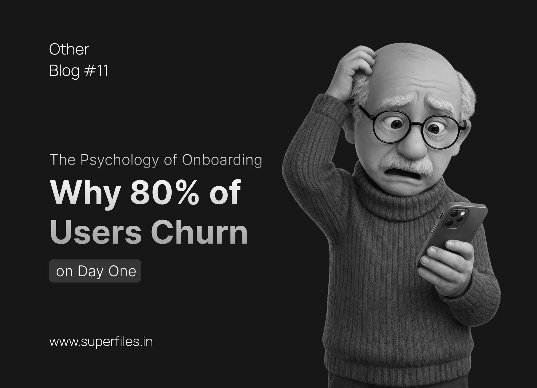
The Marketing team just spent $10,000 on ads to acquire 500 new sign-ups.
They log in. They look around. And 400 of them never return.
In SaaS, Day One retention is the most brutal metric in the business. If a user doesn't understand your software in the first 3 minutes, they are gone forever.
The problem is that most designers treat onboarding as a "feature tour." They design the core app, and then slap 15 pop-up tooltips on top of it as an afterthought.
Here is the psychological framework for designing an onboarding flow that actually converts sign-ups into power users.
80%
of users churn on Day One if they don't reach the "Aha!" moment in 3 minutes
1
The Metric That Matters: "Time-to-Value" (TTV)
When a user signs up for an invoicing app, they don't want to "learn a new interface." They want to get paid.
Time-to-Value (TTV) is the exact amount of time it takes for a user to achieve their primary goal.
The Rule
Your entire onboarding flow must be a high-speed highway to the "Aha!" moment (the moment the user realizes your product's core value).
The Fix
Strip out every form field, profile picture upload, and setting configuration that does not directly contribute to the "Aha!" moment. Ask for that information on Day 3, not Day 1.
Bloated (Day 1)
Full Name
Email Address
Password
Company Name
Phone Number
Upload Profile Picture
How did you hear about us?
Industry
Continue →
Minimal (Day 1)
Email Address
Password
Create Your First Invoice →
Left: 8 fields before the user gets any value. Right: 2 fields → straight to the "Aha!" moment.
2
Kill the "Next, Next, Next" Tooltip Tour
We all do it. A dark overlay appears, a bright tooltip points to a button, and the user frantically clicks "Skip" or hammers the "Next" button just to get it off their screen.
The Psychology
Users suffer from "Banner Blindness" for modals. They don't read them; they view them as obstacles blocking the actual software.
The Fix — Contextual Nudges
Instead of a 10-step tour, trigger a single, subtle tooltip only when the user naturally hovers near that specific feature. Teach them in the moment they actually need the tool, not in a classroom lecture beforehand.
Modal Tooltip Tour
👋 Welcome! This is the Dashboard. Click "Next" to continue the tour.
Next (1/7)Skip
DashboardProjectsSettings
+ NewImport
Contextual Nudge
DashboardProjectsSettings
+ New
💡 Start by creating a projectImport
Left: a blocking overlay the user skips. Right: hover over "+ New" to see the contextual nudge.
3
The "Empty State" is Your Most Valuable Real Estate
An empty dashboard is terrifying. If your project management tool opens to a white screen that says "You have no tasks," you are forcing the user to do the hardest thing in the world: stare at a blank canvas and figure out what to do next.
The Psychology
The fear of the blank page causes paralysis.
The Fix — The Starter Kit
Never show a truly empty state. Provide a pre-populated "Demo Project" that they can safely click around in, break, and edit.
The Alternative
Use the empty space to provide a giant, impossible-to-miss Call to Action (CTA) like "Create Your First Invoice," accompanied by a micro-video showing exactly what will happen when they click it.
Terrifying Empty State
You have no projects yet.
Actionable Empty State
Let's get you started!
Create Your First Invoice
Left: a dead-end. Right: the CTA drives the user to the "Aha!" moment instantly.
4
Progressive Disclosure (The Video Game Approach)
Think about how Super Mario teaches you to play. Level 1 doesn't have 50 enemies and flying fireballs. It has one enemy and one jump. Once you master that, the game introduces the next mechanic.
The Psychology
Cognitive overload leads to abandonment. If you show a new user a dashboard with 40 advanced charts and settings, their brain shuts down.
The Fix
Hide the advanced features. On Day 1, the interface should look incredibly simple. As the user completes basic actions, the UI should "unlock" or reveal the more complex features. You are designing a gradient of complexity.
Home
Projects
Analytics
Reports
Integrations
API Keys
Click the button to simulate the user completing tasks and "unlocking" features in the sidebar.
3 of 4 features locked
Click "Unlock" to see how the sidebar progressively reveals advanced features.
5
The "Endowed Progress" Effect
People are more likely to finish a task if they feel they have already made progress toward it.
The Psychology
If you give someone a punch card that requires 10 punches for a free coffee, they might lose interest. If you give them a 12-punch card but give them the first 2 punches for free, they are highly motivated to finish it.
The Fix
In your onboarding checklist, never start at 0%. Always start them at 25%. (e.g., "Account Created - Done!"). The psychological momentum will compel them to complete the next step.
🚀 Getting Started
25% Complete
Account Created
Create your first project
Invite a team member
Send your first invoice
Notice it starts at 25%, not 0%. Click items to check them off and watch the momentum build.
Conclusion: Onboarding Never Ends
The Key Takeaway
Onboarding is not a 5-screen wizard that disappears forever. It is a continuous psychological loop of guiding users toward deeper engagement.
We're Superfiles — a creative design agency passionate about UI/UX, motion design, and visual storytelling. Our team shares insights, resources, and pro tips to help designers level up their craft. From Figma workflows to Lottie animations, we've got you covered.