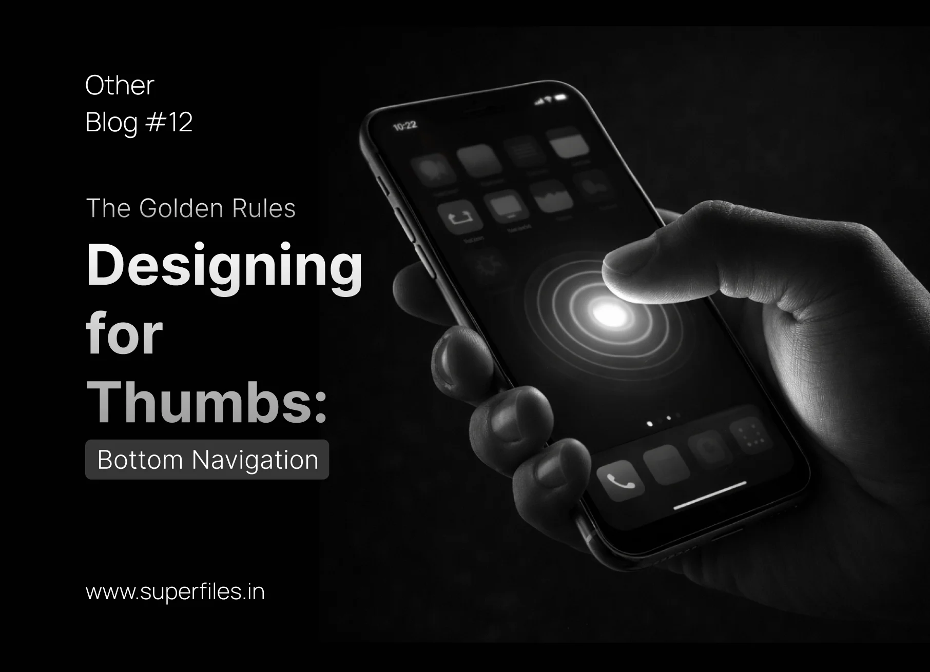
The "Reachability" Crisis
📱 Try This Right Now
Take your phone out right now. Hold it in one hand. Now, try to tap the top-left corner using only your thumb.
Unless you have the hands of an NBA player, you probably had to shift your grip, stretch uncomfortably, or use your other hand.
In 2026, the average smartphone screen is pushing 6.7 inches. Yet, many designers are still placing critical navigation items at the very top of the screen. We are designing software for devices that no longer exist.
If you want your app to feel effortless, you must design for human anatomy. You must design for the Thumb Zone. Here are the golden rules of Bottom Navigation.
☠️ Hard to Reach
🤷 Stretch Zone
👍 Comfort Zone
Danger Zone — Requires grip shift
Stretch Zone — Uncomfortable reach
Comfort Zone — Natural thumb arc
Put your primary navigation
in the green zone. Always.
For years, the three-line "Hamburger Menu" in the top-left corner was the industry standard. Today, it is an ergonomic nightmare.
The Rule
Never put primary navigation (Home, Search, Cart, Profile) in a top-left drawer.
The Exception
The top corners are now "Siberia." They should only be used for
destructive actions (like "Cancel") or
low-frequency secondary actions (like "App Settings" or "Notifications") that the user doesn't need to access every 30 seconds.
Left: Nav hidden behind a hard-to-reach burger. Right: All 4 destinations within the thumb's natural arc.
A bottom navigation bar is not a junk drawer. It is the steering wheel of your application.
The Rule
A bottom tab bar should contain a minimum of
3 and a maximum of
5 destinations.
Why: If you only have 2 destinations, use standard tabs at the top. If you have 6 or more, the touch targets become too small for a thumb to accurately hit while walking or moving. If your app has 6 core features, your app is too complicated. Group them.
Perfect (4)
Home
Search
Alerts
Profile
Too Many (7)
Home
Search
Add
Chat
Alerts
Set
Me
2 tabs → use top tabs. 7 tabs → too cramped. The sweet spot is 3–5.
What does a "Star" icon mean?
In one app, it means "Favorites." In another, it means "Premium Upgrade." In a third, it means "Leave a Review."
The Rule
Never rely on icons alone for your bottom navigation. Always pair the icon with a short,
10-pixel text label underneath it.
The Exception
If your app is universally understood (like Instagram, which has trained the world on its specific icon set for a decade), you can maybe drop the labels. But for 99% of apps, dropping labels increases cognitive load and
decreases feature discovery.
Icons + Labels
Home
Favorites
Quick Pay
Theme
Left: What does ⭐ mean? Favorites? Premium? Reviews? Right: Zero ambiguity.
Sometimes, your app exists to do one specific thing. Instagram exists to post photos. Uber exists to call a ride. A banking app exists to transfer money.
The Rule
If your app has a primary, high-frequency action, break the symmetry. Place a distinct, highly visible
Floating Action Button (FAB) or an elevated button right in the
dead-center of the bottom navigation bar.
The Ergonomics
The bottom-center of the screen is the
easiest possible pixel to reach for both left-handed and right-handed users. Put your money-maker there.
App Content Area
Home
Search
Alerts
Profile
The elevated center button is impossible to miss and sits in the perfect thumb spot. Hover to see it react.
Screen real estate is precious. While the bottom navigation is crucial for getting around, it becomes a distraction when the user actually wants to consume content.
The Rule
When the user
scrolls down (indicating they are reading an article or browsing a feed), gently slide the bottom navigation bar off the screen to give them 100% vertical space.
The Trigger
The absolute second the user
scrolls up (even slightly), snap the bottom navigation bar right back into place. This anticipates their need to navigate away.
Left: Nav visible when idle. Right: Nav hides on scroll-down, reclaiming 48px of vertical content space.
Conclusion: Ergonomics > Aesthetics
A visually stunning app that hurts your thumb to use will be uninstalled in 3 minutes.
Great mobile UX is invisible. It feels natural because it respects the physical limitations of the human hand. Pull your core features out of the hamburger menu, anchor them to the bottom of the screen, and let the thumbs do the walking.