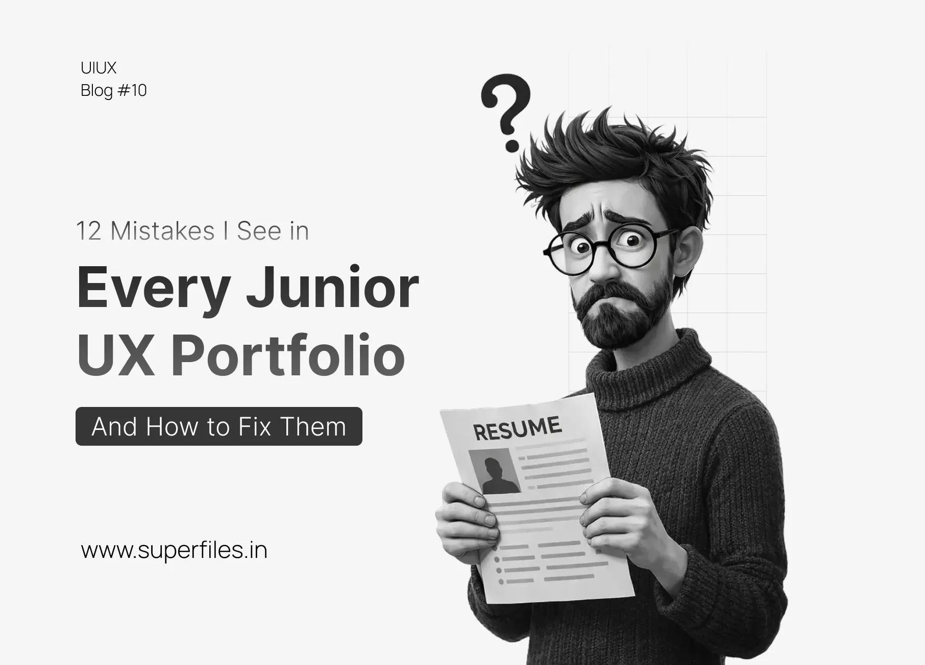
Why You Aren't Getting Interviews
You finished the bootcamp. You built the case studies. You applied to 50 jobs. Radio silence.
The problem likely isn't your visual design skills; it's your storytelling. Hiring managers in 2026 spend an average of 3 minutes reviewing a portfolio. If you make them work too hard to find the value, they close the tab.
Here are the 12 biggest mistakes Junior Designers make—and how to turn them into green flags.
🚩 The Red Flag
Every case study follows the exact same structure: Persona → Sticky Notes → Wireframes → High Fidelity. It feels like a template you filled out.
⚡ The Reality
Real design is messy. It rarely follows a perfect linear path.
✅ The Fix: Start with the Conflict
Show the struggle, not just the happy path.
❌ Instead of
"Here is my process."
✅ Say
"We thought users wanted X, but testing showed they actually wanted Y. Here is how we pivoted."
🚩 The Red Flag
You show 10 photos of generic sticky notes on a wall.
⚡ The Reality
Sticky notes prove you can brainstorm. They don't prove you can ship.
✅ The Fix: Focus on Decisions, not Deliverables
Don't just show a photo of a user journey map.
Show the one specific insight from that map that changed the final design.
Caption: "This journey map revealed that users were dropping off at Step 3, so we combined Steps 3 and 4."
🚩 The Red Flag
You redesigned Spotify/Netflix/Instagram because "it looked outdated."
⚡ The Reality
Those apps are designed by teams of 100+ seniors based on massive data. If you redesign them just for aesthetics, you show you don't understand business constraints.
✅ The Fix: Solve a Micro-Problem
Don't redesign the whole app.
Find one specific feature that is broken (e.g., "The Group Playlist feature on Spotify is confusing").
Fix that one thing deeply. It shows you can work within an existing design system—which is what 90% of your actual job will be.
🚩 The Red Flag
Your "Success Metrics" are vague things like "Users liked it."
⚡ The Reality
Companies hire designers to make money or save time.
✅ The Fix: Speak the Language of ROI
Even if it's a student project,
estimate the impact.
✅ Say
"By reducing the checkout steps from 5 to 3, we estimate a 15% increase in conversion."
✅ Say
"This new support flow would reduce customer service tickets by 20%."
🚩 The Red Flag
"Hi, I'm a passionate UX designer who loves solving problems." (So is everyone else).
⚡ The Reality
Culture fit matters. People hire people they want to work with.
✅ The Fix: Be a Human
Mention your non-design background. Were you a barista? A teacher? An accountant?
✅ Say
"I used to be a bartender, so I know how to handle difficult users under pressure."
Your past life is your
superpower. It gives you a unique perspective that other juniors don't have.
🚩 The Red Flag
Your entire portfolio or best case study is protected by a password that isn't easily accessible.
⚡ The Reality
Hiring managers review dozens of portfolios. If they have to copy-paste a password, they'll likely skip to the next person.
✅ The Fix: Make access frictionless
If you must use a password,
put it in the header/description or use non-confidential screenshots for the main flow.
❌ Avoid
"Email me for the password to see this project."
✅ Try
"Password: [UX2026]. Case study includes NDA-cleared high-fidelity flows."
🚩 The Red Flag
Light-gray text on white backgrounds or buttons that are too small to tap.
⚡ The Reality
In 2026, accessibility isn't a "nice to have," it's a legal and ethical requirement.
✅ The Fix: Show your audits
Show a screenshot of a color contrast checker or an accessibility audit. It proves you design for everyone.
🚩 The Red Flag
Using "We" for every single achievement in a group project.
⚡ The Reality
Hiring managers need to know exactly what you are capable of doing alone.
✅ The Fix: Own Your Contributions
State your role clearly at the top. Use "I" when talking about specific research you conducted or screens you designed.
🚩 The Red Flag
Broken links, images that don't load, or a navigation menu that's impossible to use on mobile.
⚡ The Reality
Your portfolio is your most important product. If its UX is bad, why should they trust you with theirs?
✅ The Fix: Audit Your Own Site
Run a Lighthouse audit. Check every link. Ensure your contact form actually works.
🚩 The Red Flag
Ending a case study with just "The End" or a final mockup.
⚡ The Reality
Seniors are always learning. Showing self-awareness is a huge sign of maturity.
✅ The Fix: Add a "Lessons Learned" section
Write 3 bullet points on what you'd change if you had more time or data. It shows you're not just a "pixel pusher" but a thinker.
🚩 The Red Flag
Linking to a Figma prototype where the "Home" button doesn't work or half the hotspots are missing.
⚡ The Reality
If you provide a link, make sure it's a polished experience. A broken prototype is worse than no prototype.
✅ The Fix: Record a Video Instead
High-quality Loom videos or GIFs are often better than raw Figma links. They control the narrative and never break.
🚩 The Red Flag
Scrolling for 5 minutes past personas and brainstorming before seeing a single high-fidelity screen.
⚡ The Reality
Unless you're applying for a pure Research role, they want to see your craft.
✅ The Fix: Show the "Hero" Shot at the Top
Put your best high-fidelity screen right at the start of the case study. Hook them with the solution, then explain the process.
Conclusion
Treat the hiring manager as your user. They are busy, tired, and skimming. Make your value obvious in the first 10 seconds. Fix these 12 mistakes, and you won't just look like a "Bootcamp Grad"—you'll look like a Junior Pro ready to work.
Want to level up your design career even more? Check out our Junior vs. Senior Portfolio Guide to understand what hiring managers really look for, or explore our free illustration sets to make your case studies stand out visually.
FAQ: UX Portfolio Tips
How many case studies should I have in my portfolio?
Quality over quantity. 2-3 deep, well-documented case studies are better than 6 shallow ones. Each case study should show your unique problem-solving approach and measurable outcomes.
Should I include personal/conceptual projects?
Yes, but frame them correctly. Instead of "I redesigned Spotify for fun," say "I identified a specific usability problem in Spotify's Group Playlist feature and designed a solution." The key is showing real problem-solving, not just visual exploration.
What if I don't have "real" metrics from my projects?
Estimate them. Use industry benchmarks or usability testing results. Say things like "Reduced task completion time by 40% in user testing" or "Based on industry averages, this change could increase conversions by 15%."
How important is the visual design of my portfolio website?
Important, but secondary to content. A clean, simple portfolio with strong case studies beats a flashy portfolio with weak content. Focus on readability, clear navigation, and fast loading speed.
Should I include the entire design process in my case studies?
No. Include only the parts that demonstrate your decision-making. Skip the generic steps everyone does. Focus on pivotal moments: key insights, difficult trade-offs, and the "aha" moments that shaped the final design.