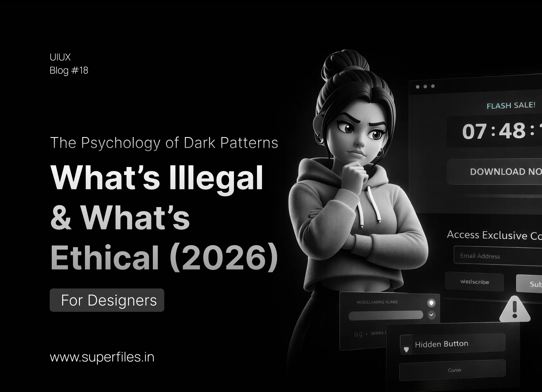
The Era of Plausible Deniability Is Over.
For years, dark patterns were the open secret of the design industry. That "unsubscribe" link buried in 8pt gray text? Dark pattern. The pre-checked "Send me emails" box? Dark pattern. The guilt-trip "No thanks, I don't want to save money" button? Dark pattern.
In 2026, the rules have changed. The EU Digital Services Act is fully enforced. The FTC has issued landmark fines. The CCPA now specifically bans "dark patterns in consent flows." And India's DPDPA has joined the global crackdown.
This isn't theoretical anymore — designers who implement dark patterns are creating legal liability for their companies. But here's what most articles miss: you can achieve the same business goals without manipulation.
This guide exposes the 7 most dangerous dark patterns, explains the psychology behind why they work, shows you what's now illegal, and gives you ethical alternatives that convert just as well.
1. Confirmshaming
Using guilt-laden language on the opt-out option to manipulate emotions. Exploits loss aversion — the fear of missing out on value.
Get 20% Off!
Get 20% Off!
2. Roach Motel (Easy In, Hard Out)
Making it extremely easy to sign up but deliberately difficult to cancel, delete, or unsubscribe. Exploits the status quo bias and effort barrier — users give up because the process is exhausting.
Real-World Example: Amazon Prime's original cancellation flow required 6 clicks through multiple pages of "Are you sure?" warnings, discount offers, and guilt-laden messages — all designed to make you give up halfway through.
2026 Legal Status: The EU now requires cancellation to be as easy as signup. One-click cancel is the standard. Amazon was fined and forced to simplify its process.
3. Misdirection — Cookie Banners
Using visual hierarchy to push users toward "Accept All" while making "Reject" tiny or hidden. The EU now requires equal visual prominence for accept and reject.
4. Hidden Costs & Forced Continuity
Hidden costs: Revealing fees only at checkout, exploiting the sunk cost fallacy. Forced continuity: Silent free trial → paid conversion, exploiting the default effect.
- Ticket: $50
- Service fee: $12
- Processing fee: $4
- Facility fee: $2
- Total: $68 (revealed at checkout)
- $68 total
- Includes all fees and taxes
- Users trust you more
- Cart abandonment drops
- "14-day free trial"
- No reminder email
- Auto-charges $49/mo on day 15
- User discovers charge weeks later
- "14-day free trial"
- Email on day 12: "3 days left"
- One-click cancel in email
- Users who stay are genuinely interested
5. Sneak into Basket & Trick Questions
Sneak into basket: Auto-adding items the user didn't choose. Trick questions: Confusing double negatives that trick users into unintended choices.
"Uncheck this box if you prefer not to not receive our email communications"
Wait... do I check it or uncheck it?
Send me marketing emails:
☐ Yes ☐ No
6. What's Actually Illegal in 2026
| Dark Pattern | EU (DSA) | USA (FTC) | India |
|---|---|---|---|
| Confirmshaming in consent | ❌ | ⚠️ | ⚠️ |
| Roach Motel (hard to cancel) | ❌ | ❌ | ❌ |
| Hidden costs / Drip pricing | ❌ | ❌ | ⚠️ |
| Forced continuity | ❌ | ❌ | ❌ |
| Unequal cookie buttons | ❌ | — | — |
| Sneak into basket | ❌ | ❌ | ❌ |
| Trick questions in consent | ❌ | ⚠️ | ⚠️ |
❌ = Banned ⚠️ = Under active enforcement/scrutiny — = Not yet regulated
7. The Psychology: Why Dark Patterns Work
Every dark pattern maps to a specific cognitive bias in your brain. Understanding these biases is the first step to recognizing — and refusing to implement — manipulation.
| Cognitive Bias | Dark Pattern | How It Tricks You |
|---|---|---|
| Loss Aversion | Confirmshaming | Fear of missing value overrides rational choice |
| Status Quo Bias | Roach Motel / Forced Continuity | People stick with defaults, even bad ones |
| Sunk Cost Fallacy | Hidden Costs | "I already picked seats, might as well pay fees" |
| Cognitive Load | Trick Questions | Confused users click the default without reading |
| Path of Least Resistance | Misdirection | Users click the biggest, most colorful button |
| Default Effect | Sneak into Basket | People rarely uncheck pre-selected options |
| Social Proof (Fake) | Scarcity Lies | "Only 2 left!" creates urgency from fabricated data |
8. Ethical Alternatives That Still Convert
Ethical design isn't about reducing conversions — it's about earning them honestly. Users who choose your product without manipulation are more loyal, less likely to churn, and generate better word-of-mouth.
Conclusion: Ethics Is the New Competitive Advantage
Dark patterns worked — past tense. They boosted short-term metrics by exploiting human psychology. But in 2026, they're not just unethical — they're illegal, expensive, and brand-destroying.
The smartest companies have already figured this out: transparent design builds trust, trust builds loyalty, loyalty builds revenue. The conversion rate might dip by 3% when you remove the guilt-trip — but your churn rate drops by 40%.
The Bottom Line:
Design for the user you'd want to be. That's not just ethics — it's good business.
FAQ: Dark Patterns & Ethical Design
In the EU under the Digital Services Act, yes — individuals involved in designing known deceptive patterns can face personal liability. In the US, the FTC targets companies but is increasingly naming responsible individuals.
Only if the timer is fake (resets when you reopen the page). Genuine time-limited offers with real deadlines are perfectly fine. The test is honesty — is the scarcity real?
Not always. Pre-selecting "Remember me" serves the user's interest. Pre-selecting "Sign me up for marketing" serves the company's. The test: does the default benefit the user or the company?
Frame it as risk management: "This pattern is now illegal in the EU and under FTC scrutiny. The fine can be up to 6% of global revenue." Legal fear is more persuasive than ethical arguments.
Persuasive design helps users make decisions they already want to make (clear CTAs, social proof). Dark patterns trick users into decisions they wouldn't make if they fully understood what was happening. The line is informed consent.

Superfiles


Lemonade Wishes