The "Freemium" Trap
We have all been there. You find a perfect icon set, download it, and then realize:
- You have to provide a link back to the author (Attribution).
- You only get the "Line" version, and the "Filled" version costs $29.
- It hasn't been updated since 2019.
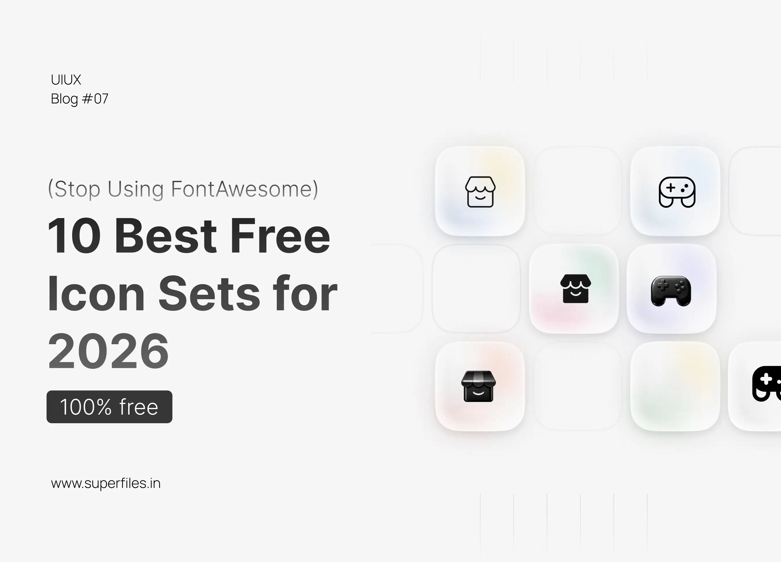
Top 10 Free Icon Sets You Should Be Using Right Now
Solar Icons
The Trendy Pick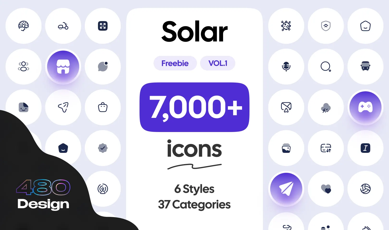
Why it wins: This is the breakout star of 2026. Solar icons use "100% corner smoothing" (super-rounded corners), giving them a friendly, premium "iOS" feel. Perfect for modern mobile apps and fintech dashboards.
Lucide
The Developer's Favorite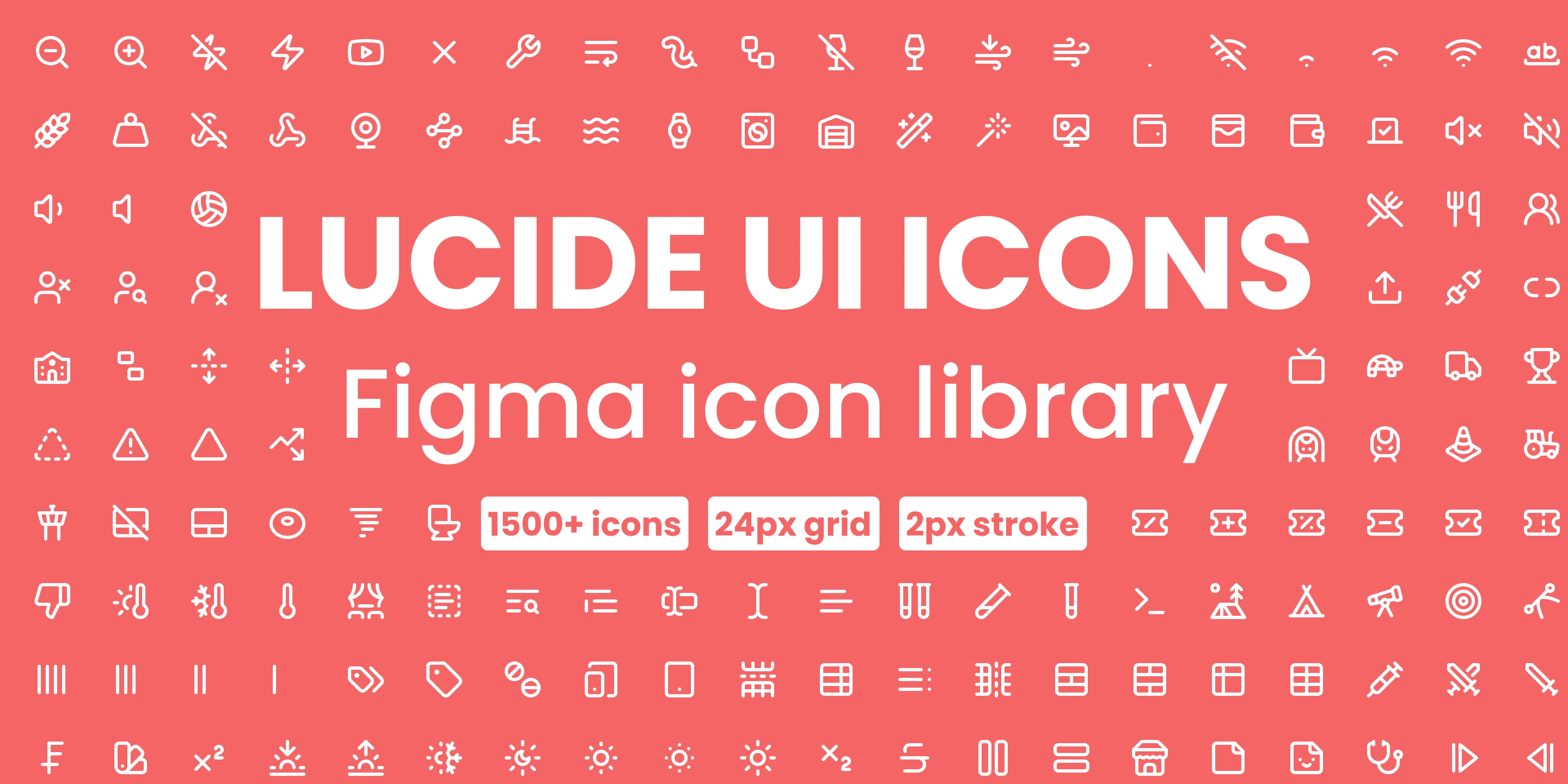
Why it wins: If you hand off designs to developers using Shadcn/UI or Tailwind, they will love you for using Lucide. It's the industry standard for code-friendly icons—lightweight, consistent, and looks good at any size.
Phosphor Icons
The Most Flexible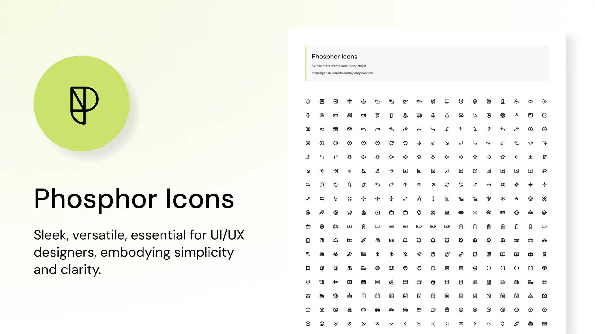
Why it wins: Most icon sets only give you "Regular" and "Bold." Phosphor gives you Thin, Light, Regular, Bold, Fill, and Duotone. Perfect for creating "Active" states in your navigation bar.
Untitled UI Icons
The Neutral King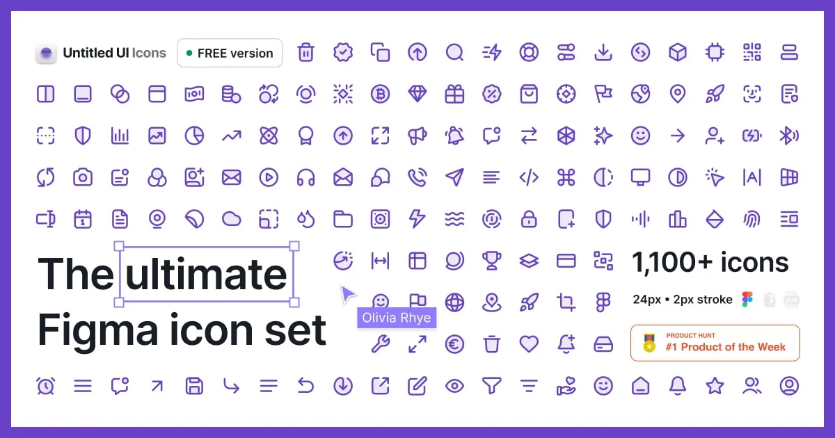
Why it wins: Created specifically for Figma users. Designed with a 2px stroke on a 24px grid, making it the most balanced "neutral" set on the market. Fits into any project without stealing attention.
Hugeicons
The Massive Library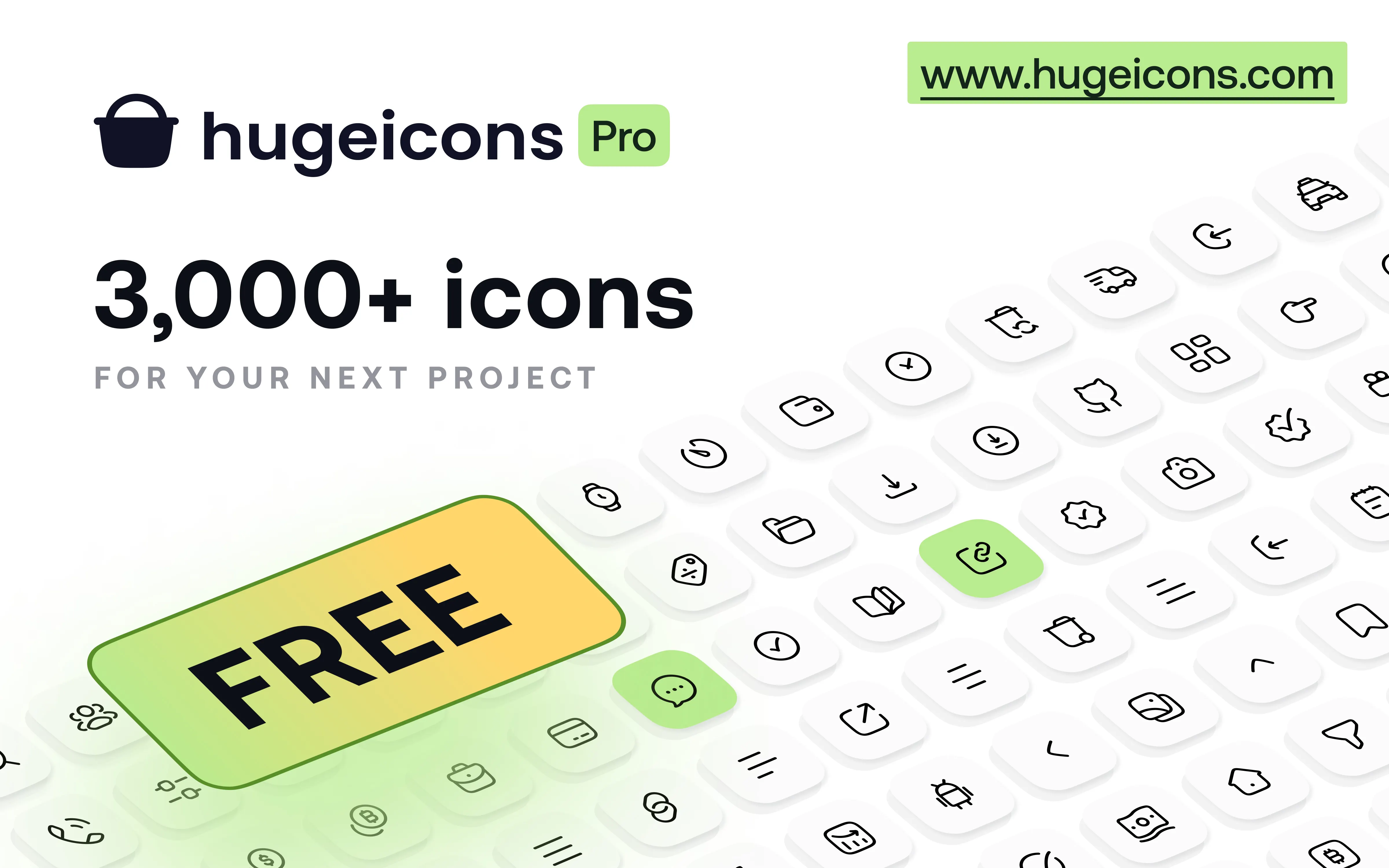
Why it wins: As the name suggests, it's huge. Top-tier stroke quality and the "Bulk" style (two-tone) is perfect for adding color to dashboards without custom illustration work.
Remix Icon
The System Standard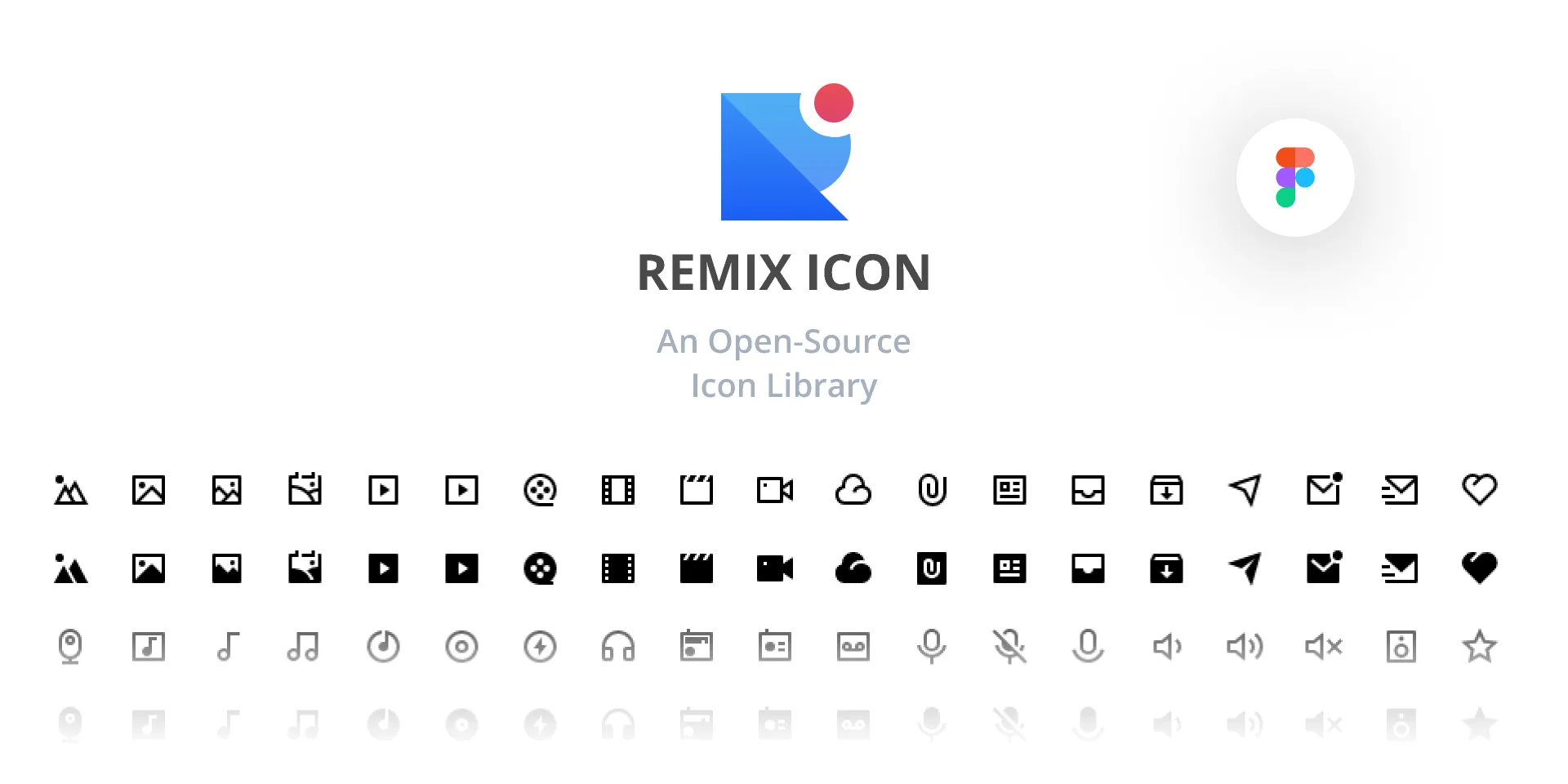
Why it wins: Icons that look native on Apple or Android devices. They're "system-neutral" with no strong personality—exactly what you want for complex enterprise software.
Tabler Icons
The Stroke Specialist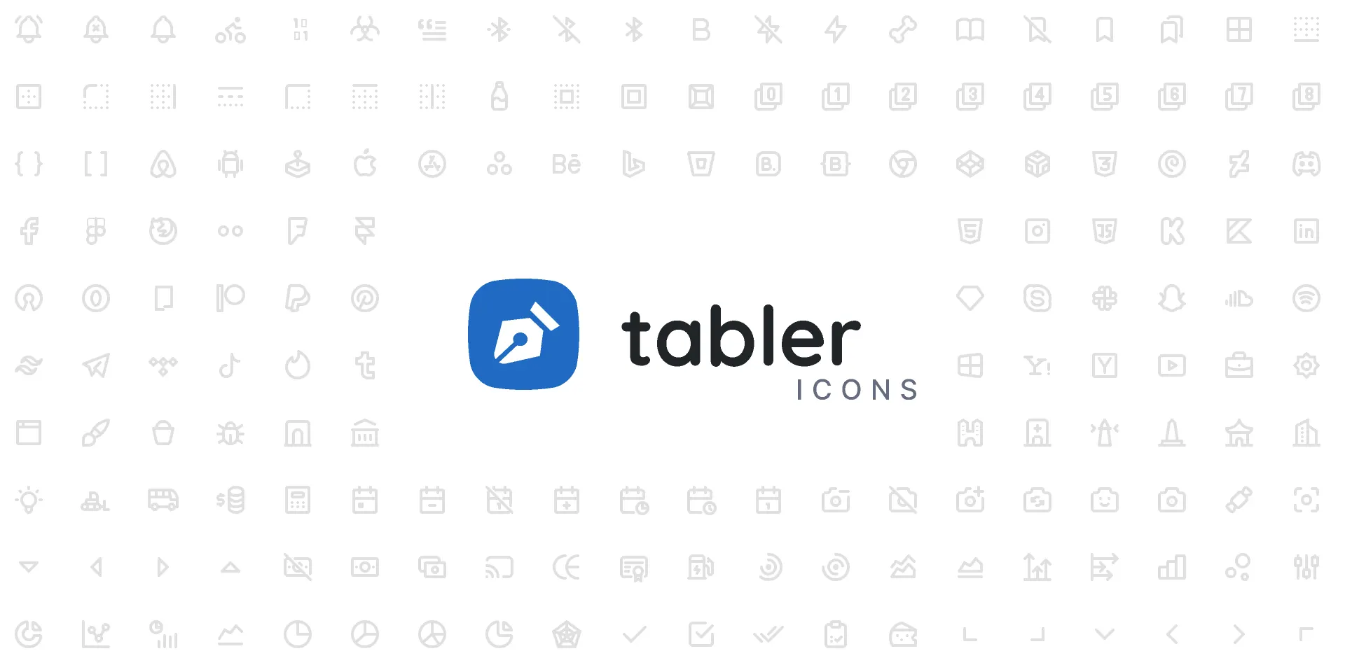
Why it wins: Pixel-perfect. Every icon is built on a 24px grid with a 2px stroke, and you can easily adjust stroke width in CSS or Figma to make them chunkier or thinner.
MingCute
The Playful Choice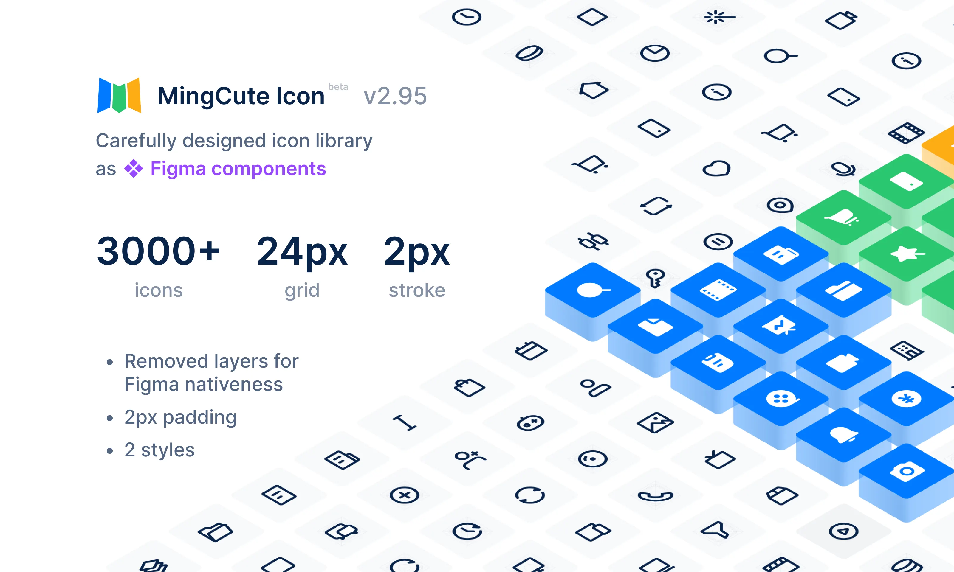
Why it wins: When you don't want "corporate," you want "fun." Bouncy, rounded character that works perfectly for social media apps, food delivery, or lifestyle brands.
Google Material Symbols
The Safe Bet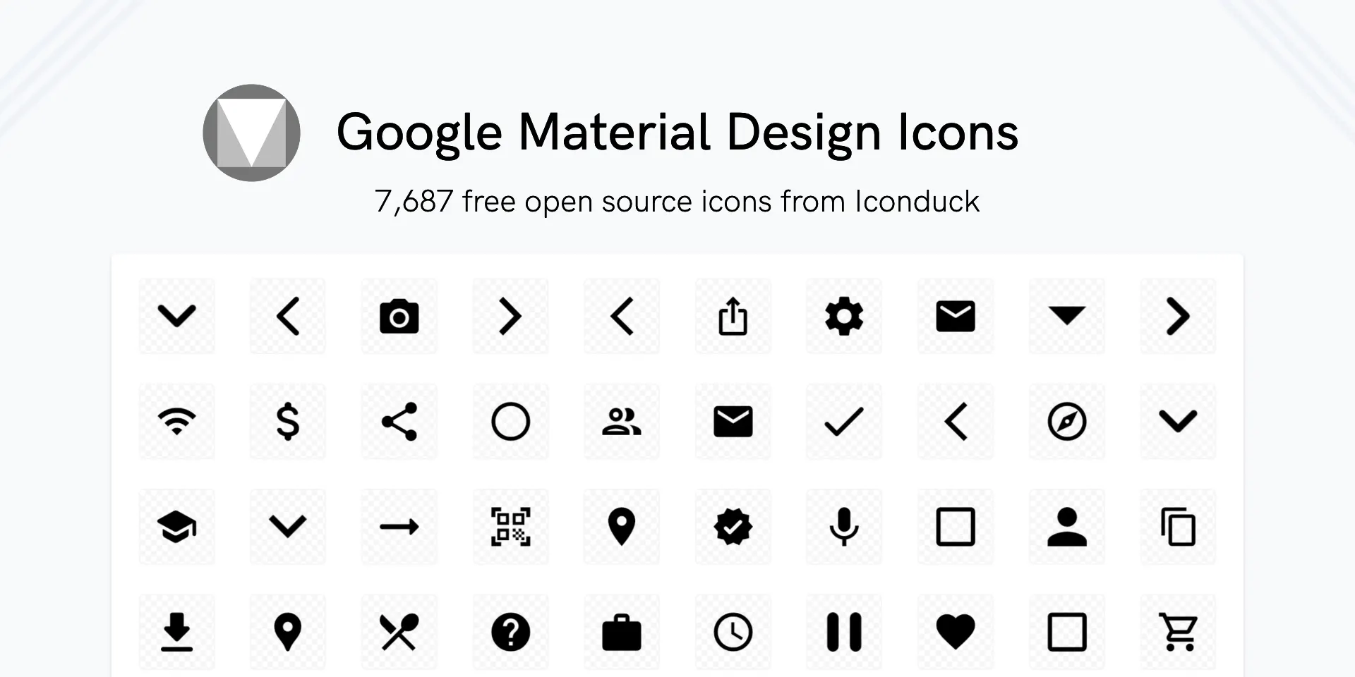
Why it wins: It's Google—it will never disappear. The new "Symbols" version lets you adjust "Grade" (thickness) and "Optical Size" dynamically in code. Most accessible-friendly set on this list.
Heroicons
The Tailwind Essential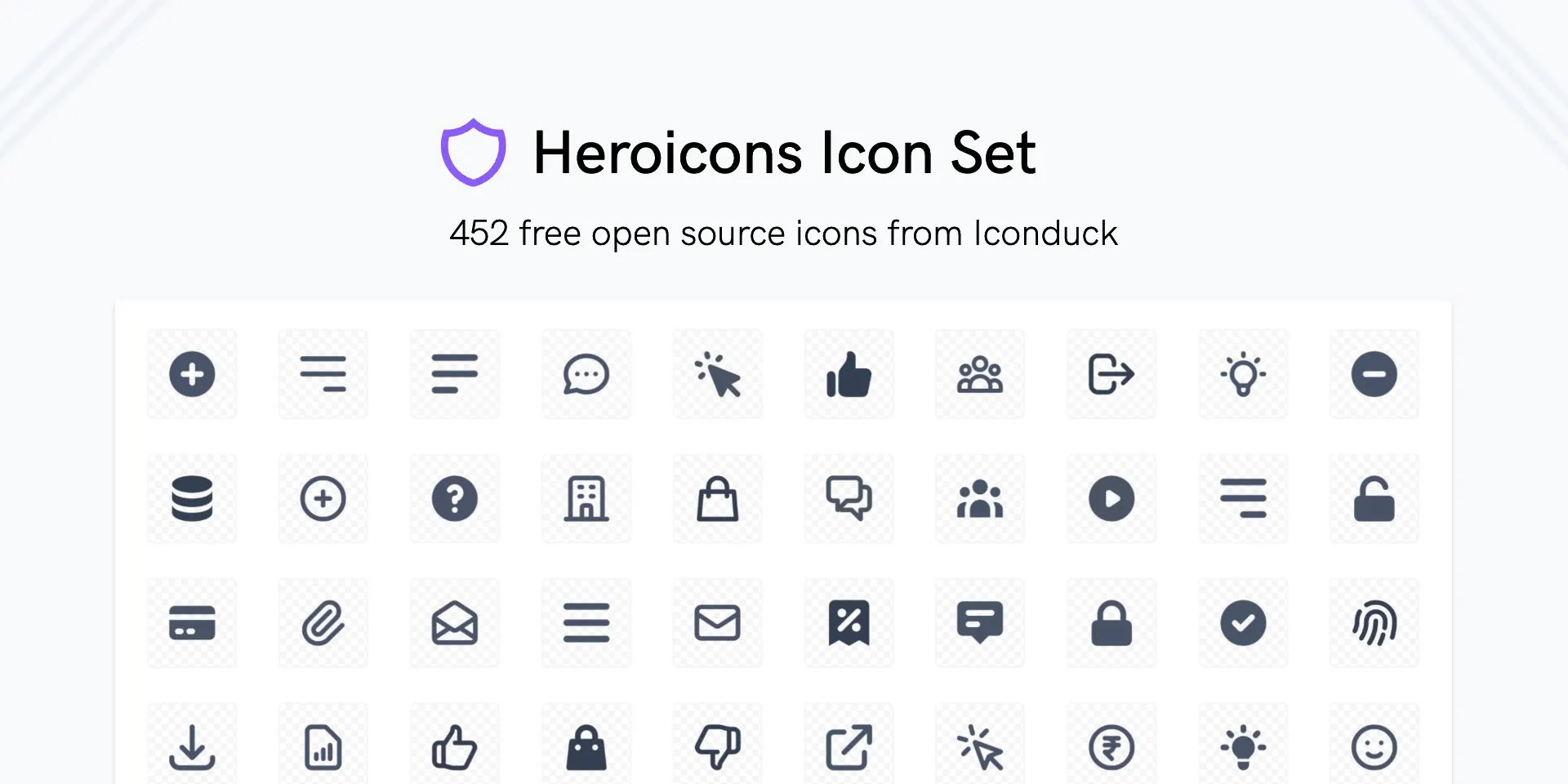
Why it wins: Small but mighty. If you're building with Tailwind CSS, these are native—handcrafted by the Tailwind team. Perfect for MVPs and fast builds.
Conclusion: How to Choose?
With so many great free options available, choosing the right icon set comes down to your project type:
- Building a SaaS Dashboard? Use Lucide or Untitled UI.
- Building a Mobile App? Use Solar or MingCute.
- Building a Complex System? Use Phosphor or Remix.

Superfiles


Lemonade Wishes