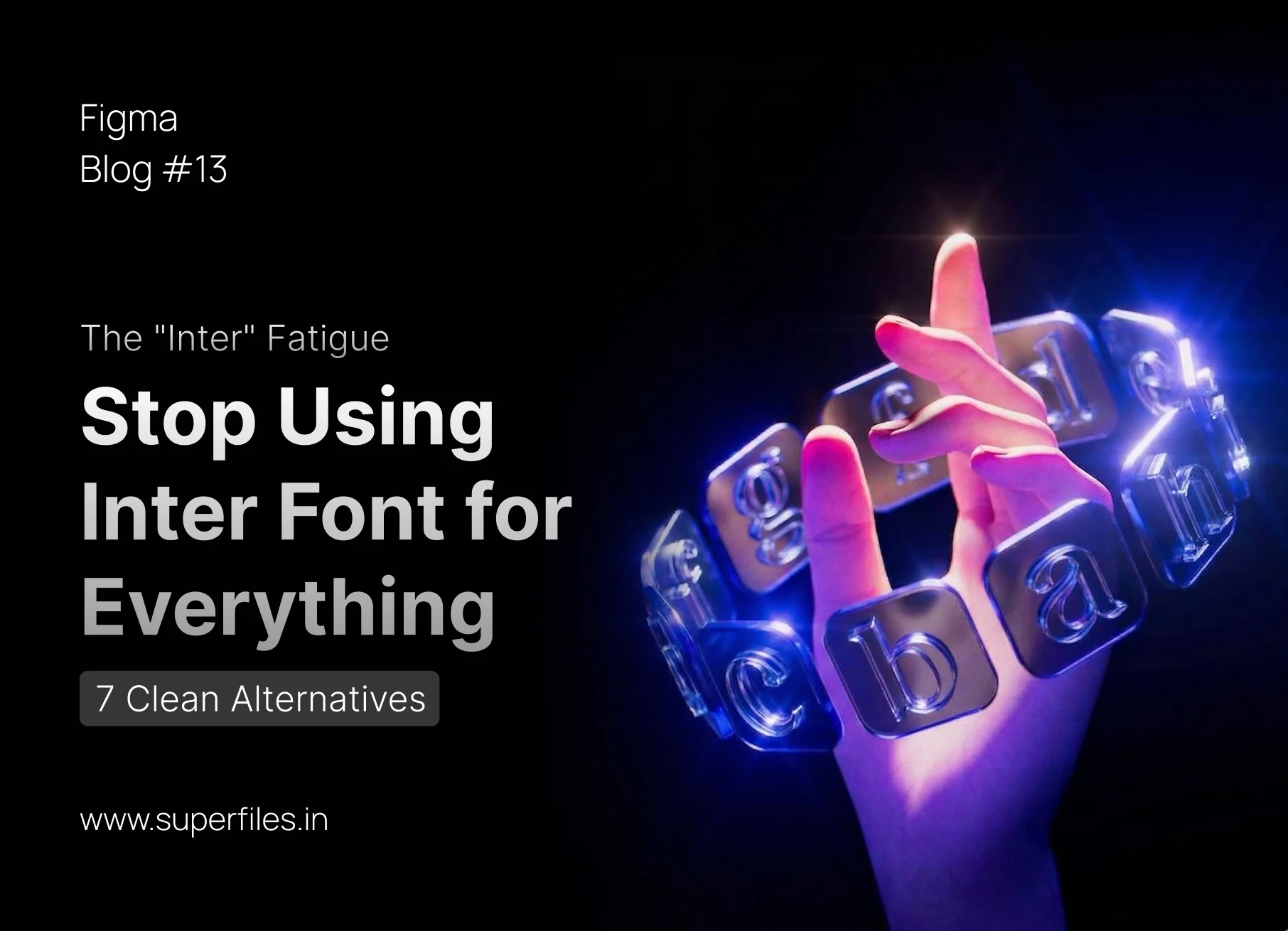
The "Inter" Fatigue
If you open Dribbble, Twitter, or Figma Community in 2026, 90% of the designs use the exact same typeface: Inter. It looks beautiful. It is highly readable. It is the "safe" and predictable choice for digital products. But it is also becoming incredibly boring.
Designers are currently forcing Inter onto every single UI, even when the brand needs a distinct personality. Inter is fantastic for a dense SaaS dashboard where functionality is the only goal, but it severely lacks the unique character needed for a standout marketing page or a distinct web application. We are losing the art of typography to convenience. It's time to break the habit.
7 Clean Alternatives to Inter
Satoshi is a modernist sans-serif that tightens up the geometry perfectly. While Inter can feel very neutral and almost invisible, Satoshi brings a touch of editorial sophistication with its slightly squared curves. It's perfect for premium SaaS, modern fintech apps, or high-end consumer products that want to look sharp, clean, and expensive without feeling overwhelming.
Developed by Vercel, Geist is designed specifically for developers and heavily technical brands. It has a beautiful, precise construction that makes technical documentation and complex developer tools look elite. If you are building an API dashboard or a tool for engineers, Geist gives you that instantly crisp, monospace-adjacent technical feel without sacrificing body text readability.
If you really just want a robust, classic layout without the predictable "tech default" feel of Inter, Switzer is your best bet. It nods to mid-century neo-grotesques but cleans up the proportions for modern high-resolution screens. It remains intensely balanced and timeless, letting your UI layout and content do the talking.
Created by GitHub, Mona Sans is a strong, industrial sans-serif that can stretch and bend to your will. It feels significantly bolder and has much more personality than Inter. Use Mona Sans when your UI needs a little bit of weight and an approachable, industrial "get stuff done" vibe. It's fantastic for project management tools and heavy-duty productivity apps.
Originally built by the United States government (USWDS) for massive digital interfaces, Public Sans is perhaps the closest true workhorse alternative to Inter. It is profoundly stable, completely devoid of unnecessary aesthetic flair, and brutally honest. It's the perfect invisible font for massive, complex, multi-layered enterprise applications where absolute clarity is required.
Where Inter can sometimes feel cold, robotic, and clinical, Figtree introduces genuine approachability. It has slightly friendlier curves and distinct geometric simplicity, making it an excellent choice for consumer apps, social platforms, and interfaces that want to feel simple and welcoming. It's the font equivalent of a friendly handshake.
A geometric sans-serif that leans heavily into modern brightness. Plus Jakarta Sans feels exceptionally clean and crisp, yet it miraculously maintains an approachable, professional spacing. It's ideal for fresh startups, engaging B2B platforms, and any UI that wants to exude a positive, energetic tone while remaining highly legible.
Inter is undisputedly a masterpiece of digital typography. But relying on it for every single project makes the web a homogeneous, sterile place. The next time you start a new UI project in Figma, resist the urge to just leave the font selector on default. Give Satoshi, Geist, or Figtree a try—your interface will instantly feel more considered, intentional, and unique.
Hiren Patel

Lemonade Wishes